Kerning is the process of adjusting the spacing between individual characters in a font. This is done to achieve a visually pleasing and balanced appearance of the text. But as with most things, every now and then, things can go wrong.
Put the symbols too close or too far from one another and you end up with awkward or humorous typography. For example, if a company wanted to make a poster advertising their "cleaning" services but made the spacing between the letters "c" and "l" too tight, it can create the word "dining" instead.
The funny part is that such mistakes are more common than we might think. And the Facebook group 'The Real Crime Is That Kerning' has all the proof. Here are some of their finds.
#1 Apply At..???
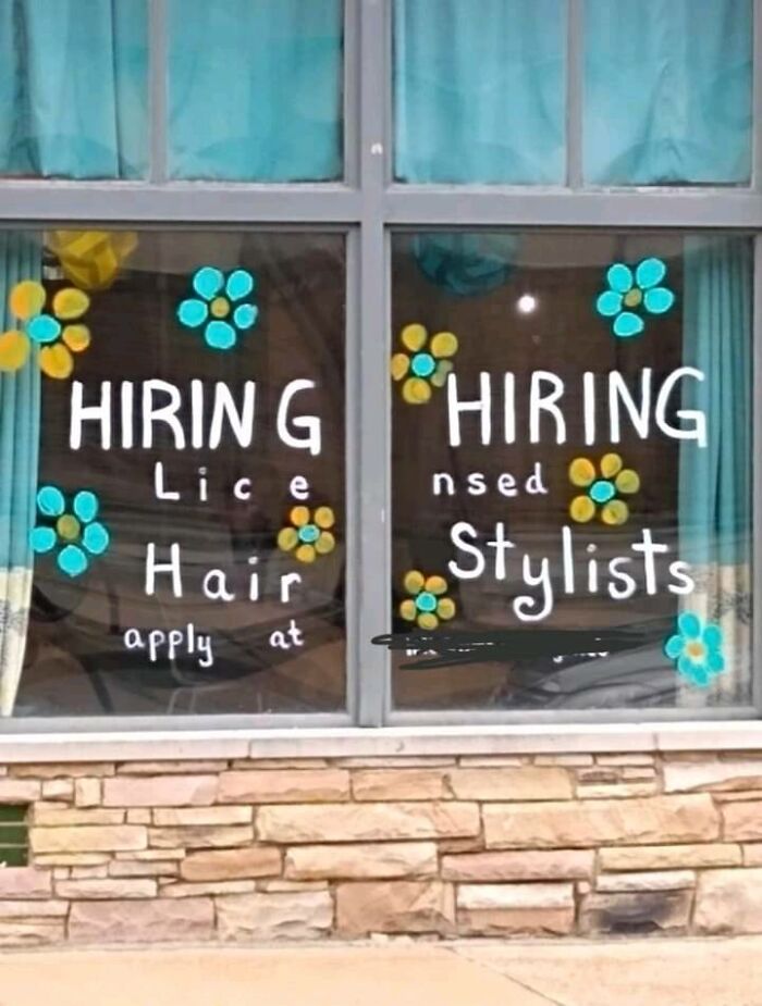
Image credits: Disa Giada
#2 Wot & Who?
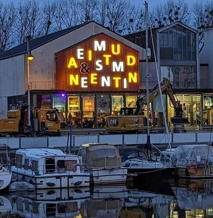
Image credits: John Lund
#3 If You Go Hiking In The Bamboo Forest, You Better Check For Ticks

Image credits: Laura Brooks
#4 It's Rush Because Go Time!
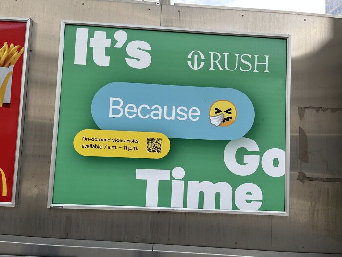
Image credits: Radhika Rawat
#5 Good Job, Walmart. If You Could Just Schooch The "Gurt" A Little To The Left
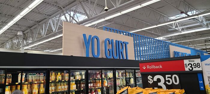
Image credits: John Paul Drummond
#6
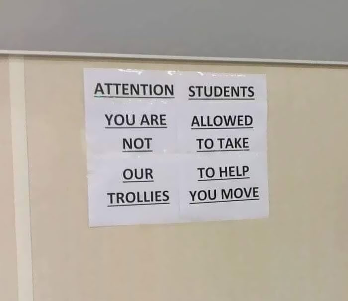
Image credits: Justin Cornelius
#7 Car Pets Are The Best Pets
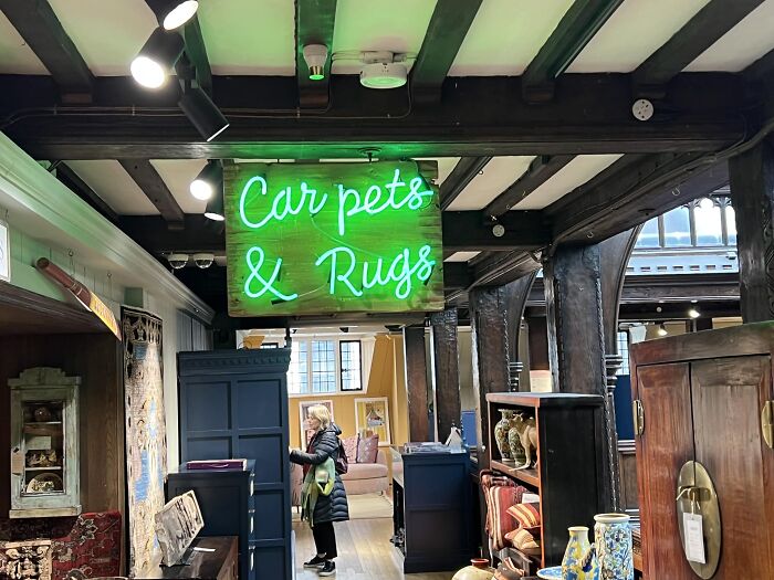
Image credits: Brendan Tompkins
#8
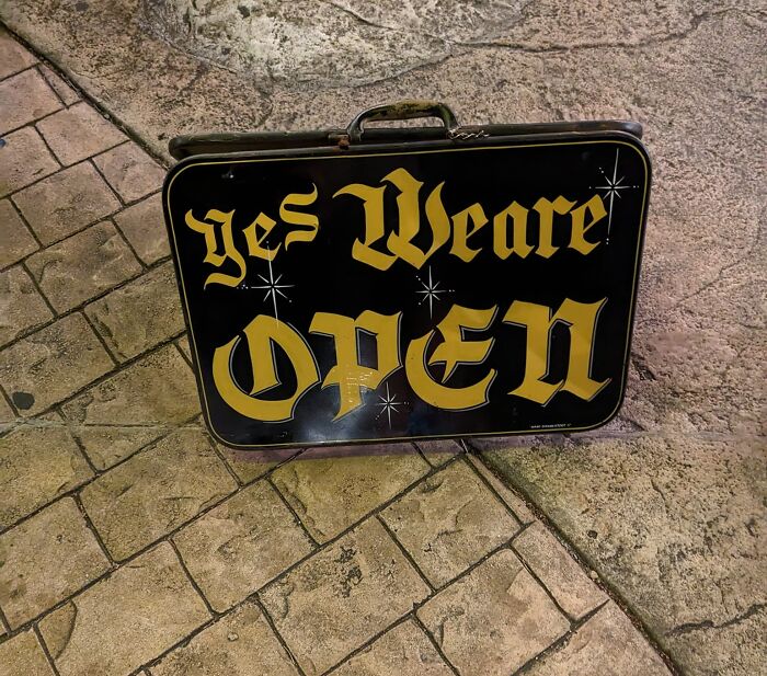
Image credits: Andrew Shaw
#9 In Nails I Trust
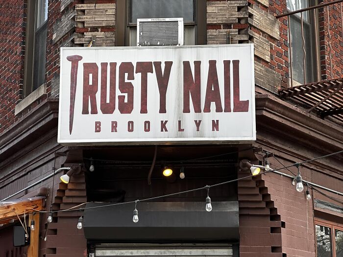
Image credits: Antonio M. Rosario
#10 Fail
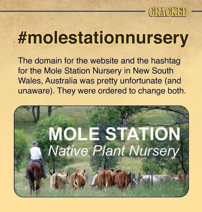
Image credits: Grant Bright
#11 We Are Open
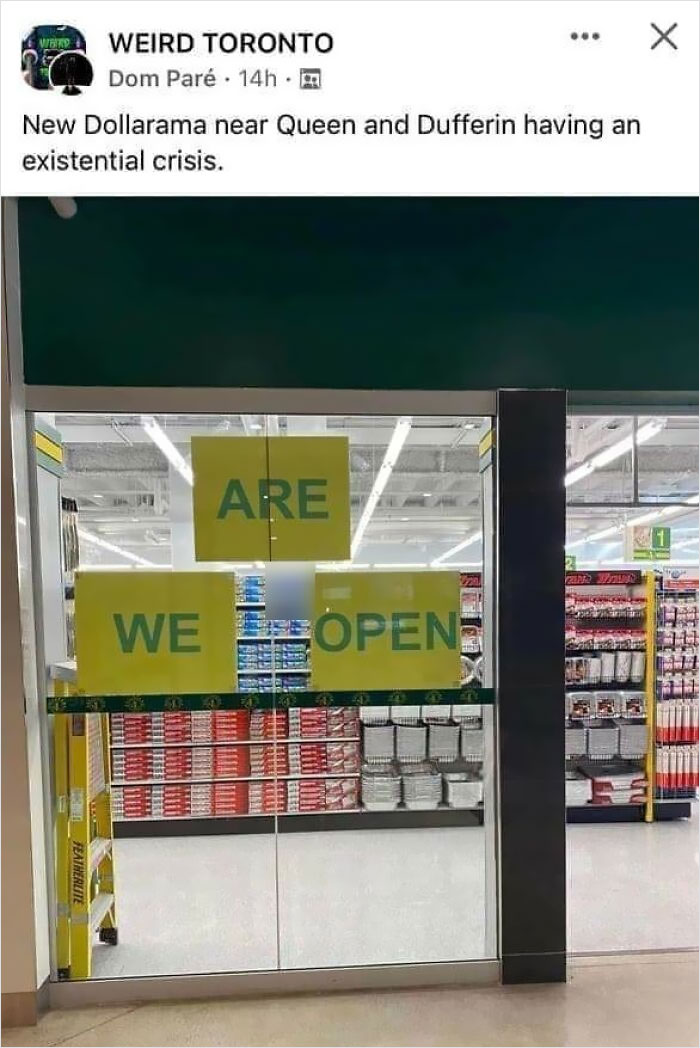
Image credits: I. Lee Tudela Williamson
#12 Font Shaming And Spelling Issues? I Want This To Say *exploring* But It Just Doesn’t
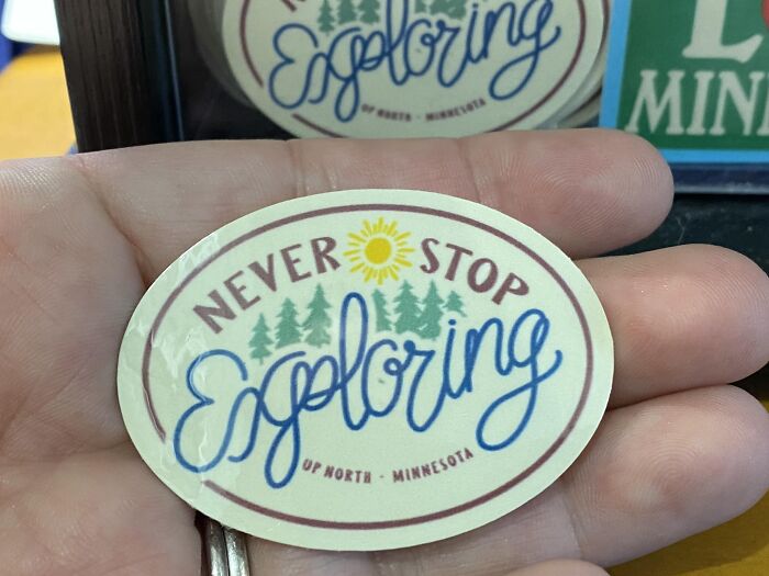
Image credits: Sarah Guptill
#13 The Real Crime Is You Knew Darn Well What That Looked Like And Sent It To Print Anyway
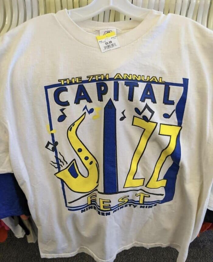
Image credits: Elise Payne
#14 Dishwasher
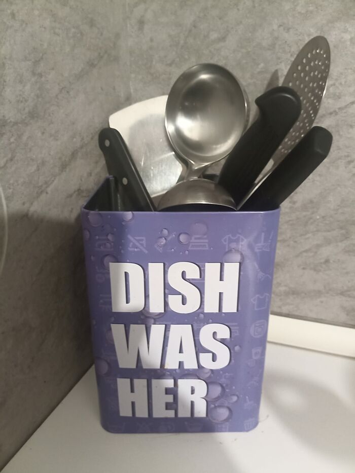
Image credits: Salvatore Kalaka
#15 He Is Trisen
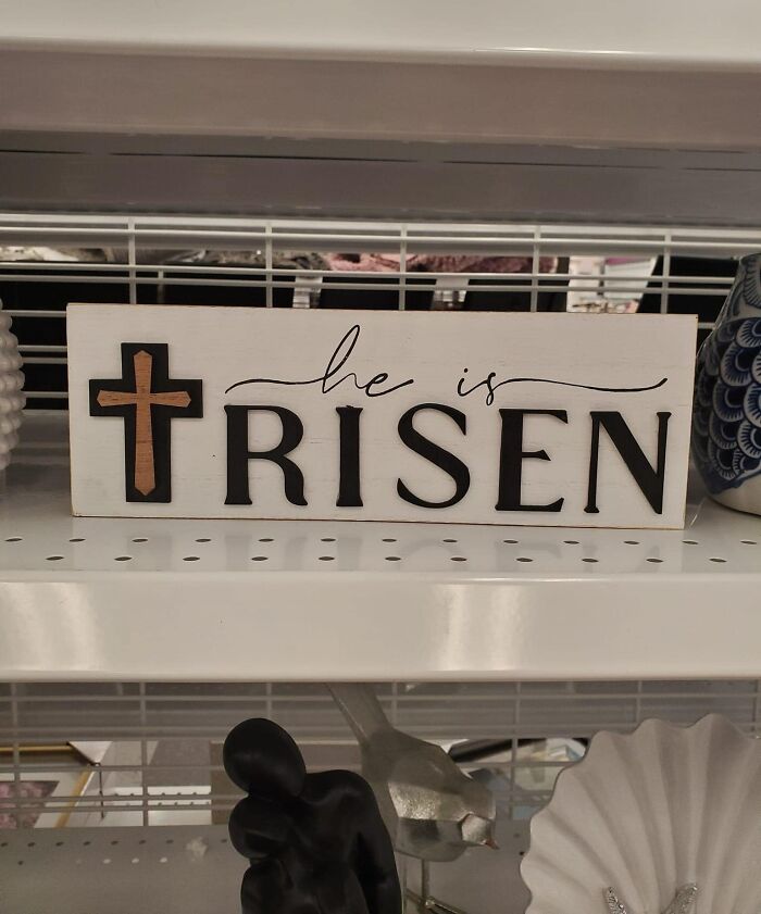
Image credits: Melissa Andrea Gutiérrez
#16 Nope I'll Get Mine Done Somewhere Else
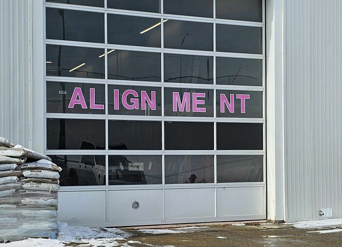
Image credits: Carl Mellesmoen
#17 Some Are Neon The Kerning Thing
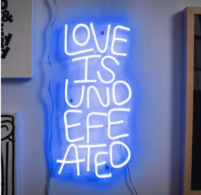
Image credits: David Gugenheim
#18 Wait... I'm Confused. Is The Food From China Or Togo?
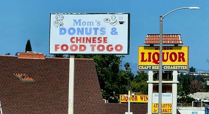
Image credits: Michael Andrew
#19 Amazing Pizza. Atrocious Kerning
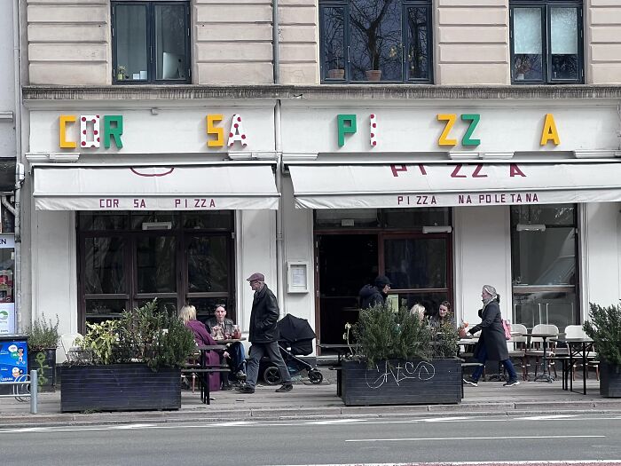
Image credits: Matthew Summey
#20 Finally Found One In The Wild!
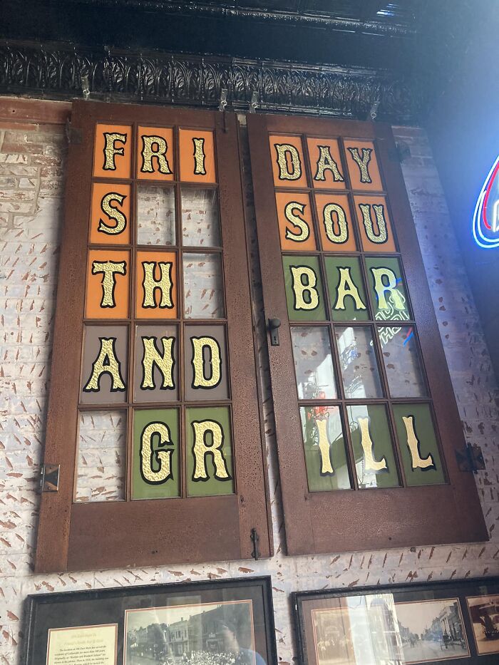
Image credits: Bradlee Slusser
#21 I Guess It's More Font Choice, But The High School That My Girlfriend Teaches At Is Fort White High School, But All I See Is Fart White In Their Gym
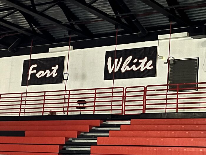
Image credits: Mike Stabile
#22 Finally Found Something

Image credits: Joe Odekerken
#23 6nly Sod Gan Gugjmel
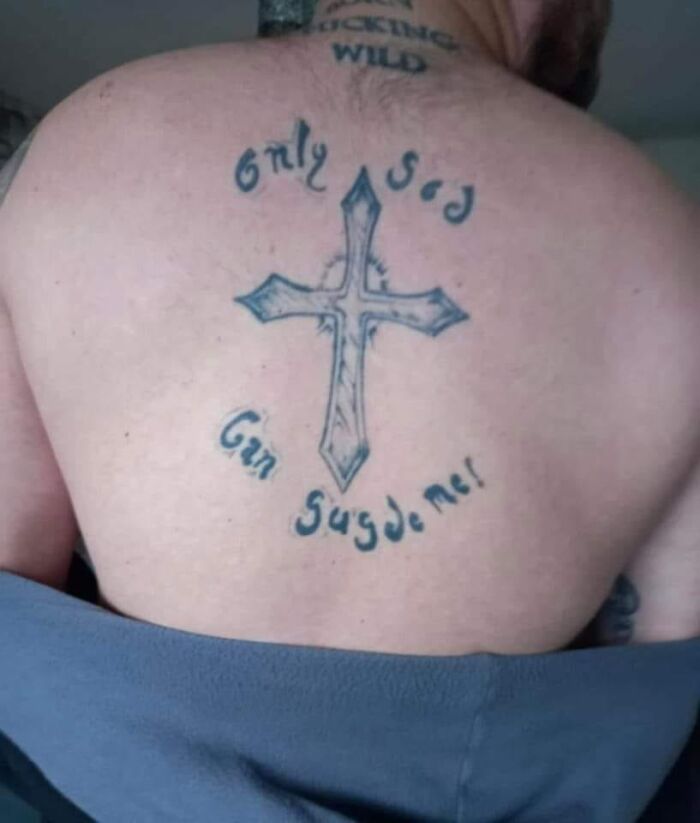
Image credits: John Lund
#24 Church Of Bod Douth Balls
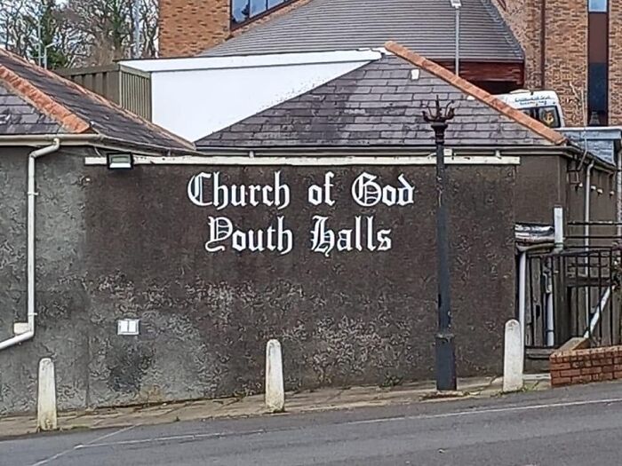
Image credits: Maria McCarthy
#25 F Jords
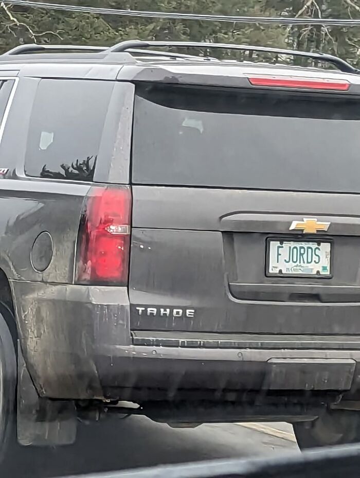
Image credits: Alex Suzzi
#26 Hahahahaha Forgive Me This Isn’t Strictly A Kerning Issue But It Made Me Laugh

Image credits: Christopher Wright
#27 Home Ffice? Hom Effice?
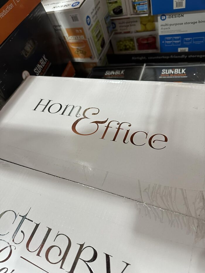
Image credits: Zach Droubay
#28 Sinkist?
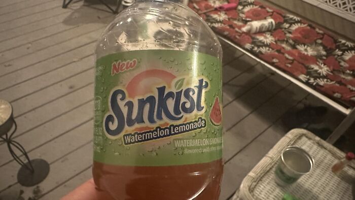
Image credits: Chris Birkbeck
#29 Chips
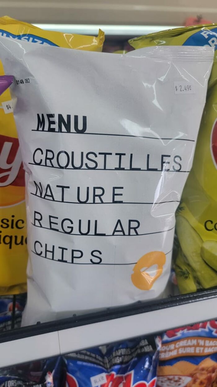
Image credits: Chris Weaver
#30 Shampoo
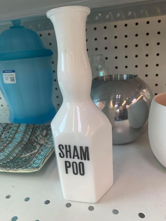
Image credits: Alexis Rabinowitz
#31 Somebody Hit The -1000 Button
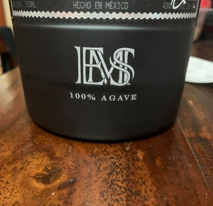
Image credits: Alek Gembinski
#32 Please Don
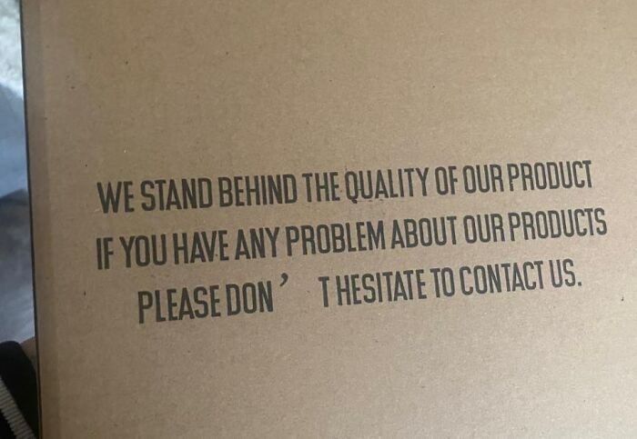
Image credits: Jenna Wasakoski
#33 It’s Not Like They Didn’t Have Enoughroom
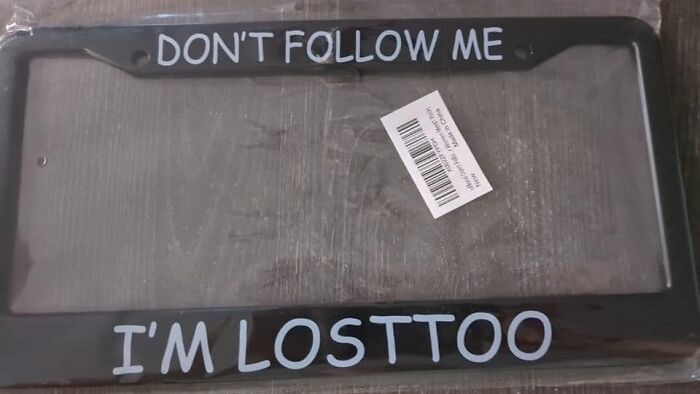
Image credits: Mary Becker Cunningham
#34 Cool Craft Bar In Richmond
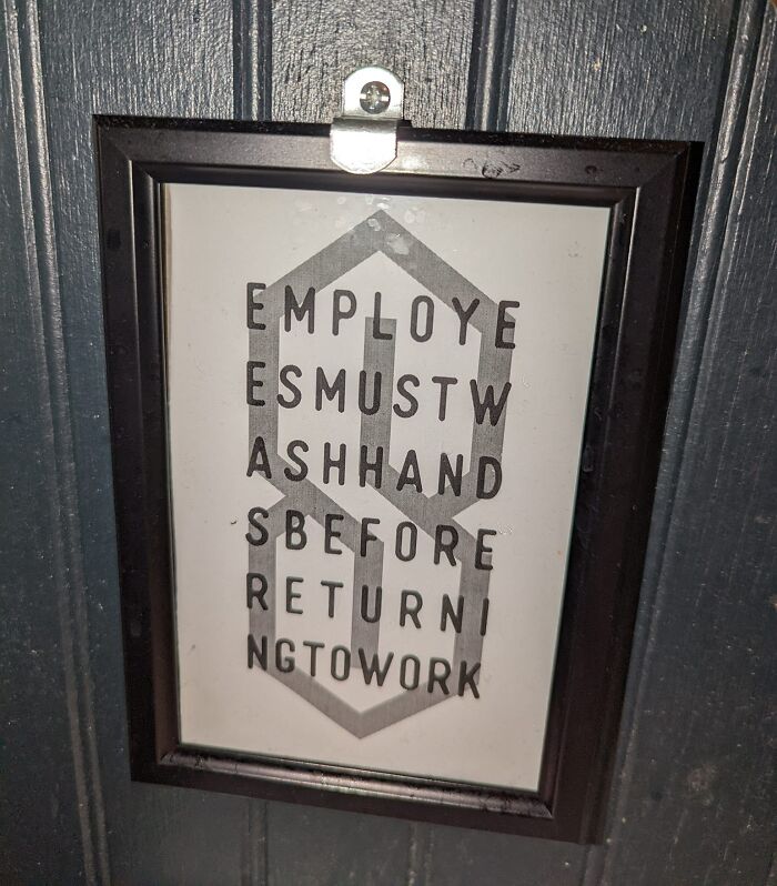
Image credits: Chris Mcdaris
#35 Something I Hated Today
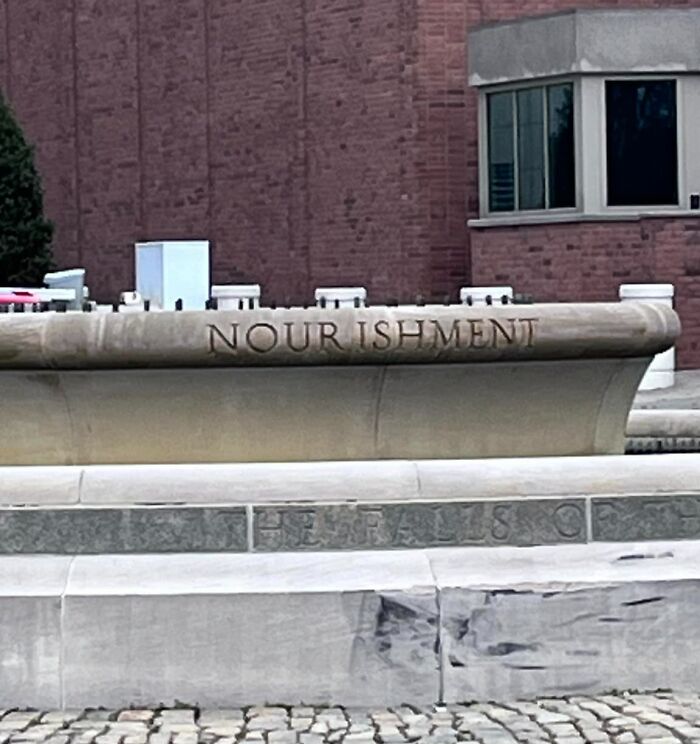
Image credits: Nikki Kimberly
#36
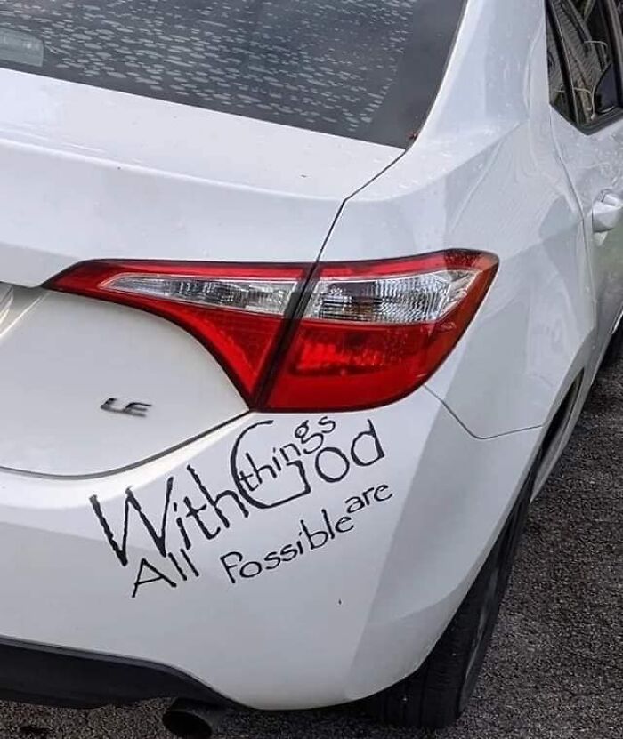
Image credits: Corey Perrine
#37 I Got This T-Shirt At A Conference And It Bothers Me To This Day

Image credits: They Themmington
#38 W Hyy Yyyyy???
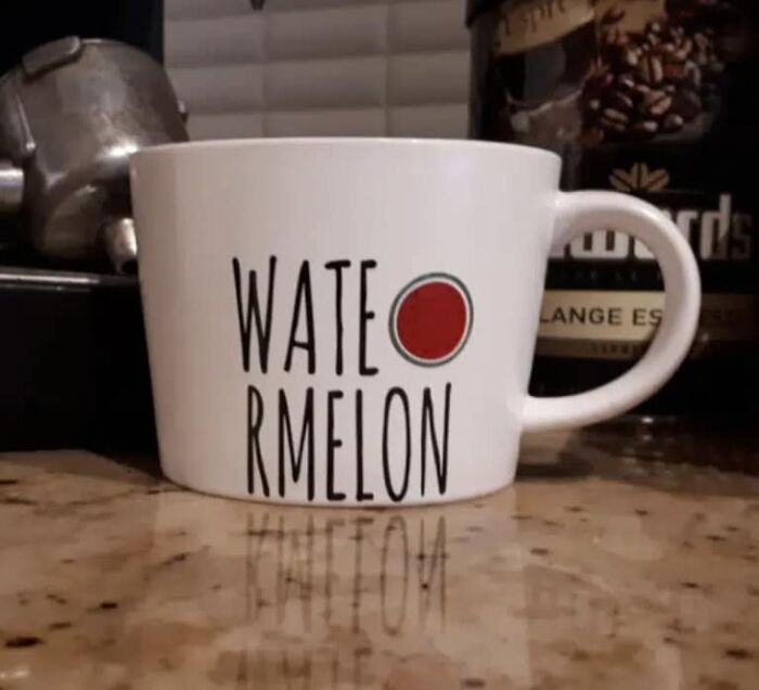
Image credits: Joel White
#39
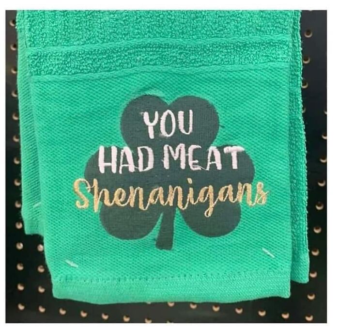
Image credits: Erin Vierthaler
#40 I Just Saw This Posted In A News Article - Better Kerning Might Have Left Space For The Whole Word To Fit. Image Of A School With "The School District Of Philadelph" In Shiny Block Letters
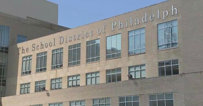
Image credits: Steve Cooperstein
#41 Anniversary Dinner At The Tas T Ingroom
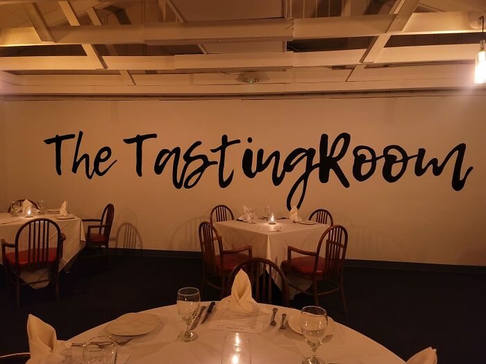
Image credits: Heather Holmes
#42 Smell Ya Later, Smenu
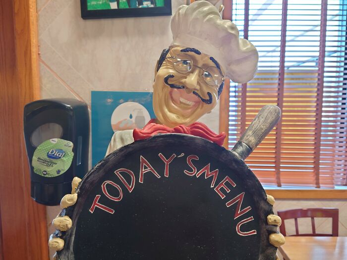
Image credits: Erik Larson
#43 I Mean Come On
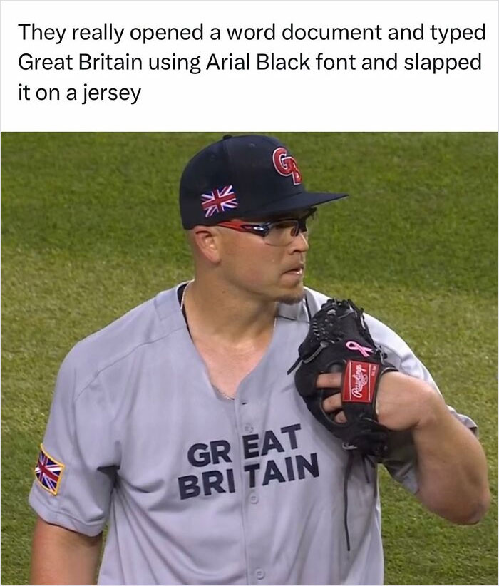
Image credits: Jomboy Media
#44
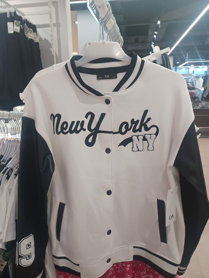
Image credits: Sam Anthony
#45 I Just Saw This In A Market In Georgia Today And Could Not Stop Laughing. You’re Welcome
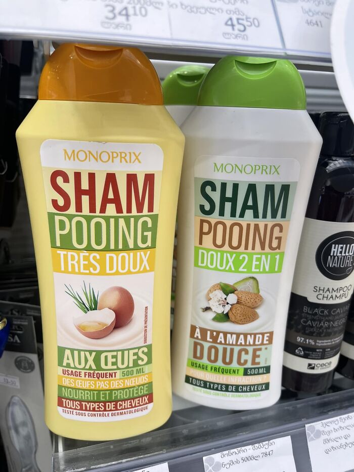
Image credits: Olajide Paris
#46 This Stresses Me Out. In The Living Room Of A Sober Living House. I Feel Like They Weren’t Very Sober When They Did This
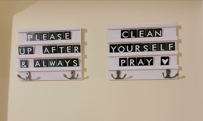
Image credits: Brie' DeShae Hughes
#47 The Closer You Look, The Worse It Gets
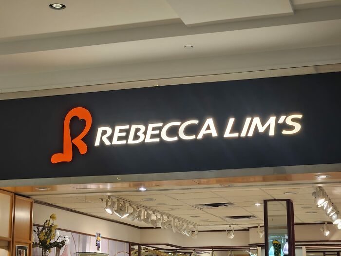
Image credits: Aaron Duff
#48 Saw In The Wild And Thought Of You All
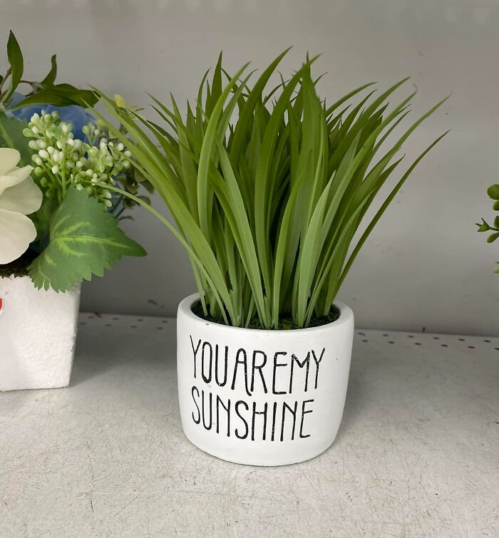
Image credits: Christina Elle
#49 Today I Learned That Automotive Professionals Are Not Typesetting Professionals
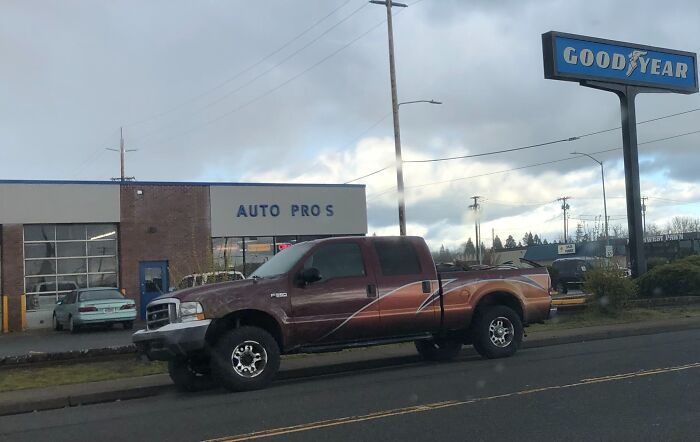
Image credits: Tom Bagel Donohue
#50
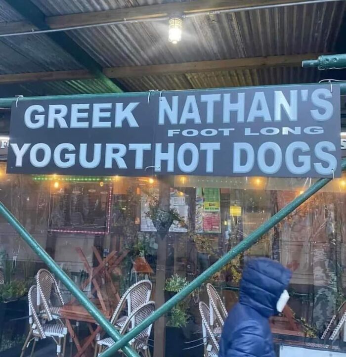
Image credits: Trisha Bagby
#51 Pudding Turkey!
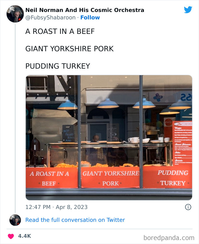
Image credits: FubsyShabaroon
#52 I Love Le Cher (French Department) vs. I Love Lécher (To Lick)

Image credits: Damien Damien
#53 Saw This At A Local Park Today And Knew I Had To Snap A Pic To Share
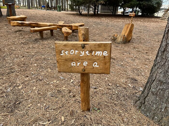
Image credits: Kate Buss
#54 Found In The Wild At Our Local O'charley's
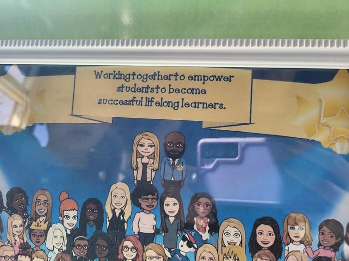
Image credits: Alyson Taylor
#55
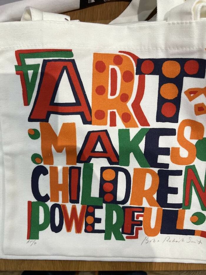
Image credits: Brendan Tompkins
#56 This Has Bothered Me For Years. And It's Not Just Decals - All Of Their Signs Are Like This, Too
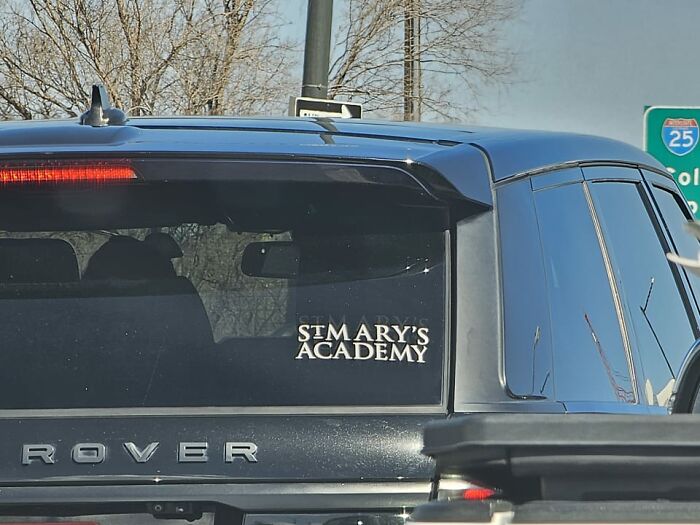
Image credits: Dev Adams
#57 Love It!
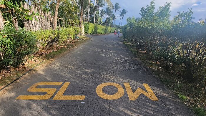
Image credits: Jack Harris
#58 Finals
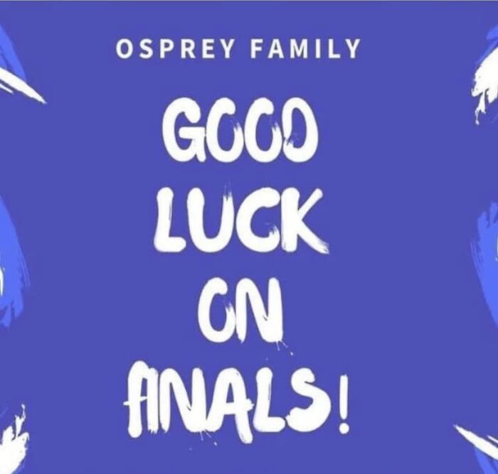
Image credits: Alexis Rabinowitz
#59 B A Ylea Ves Spotted At A Local Market
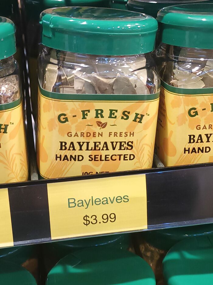
Image credits: Blake Ellis
#60 A While Ago I Was An Extra On The Last Of Us, And I Had To Wait To Share This
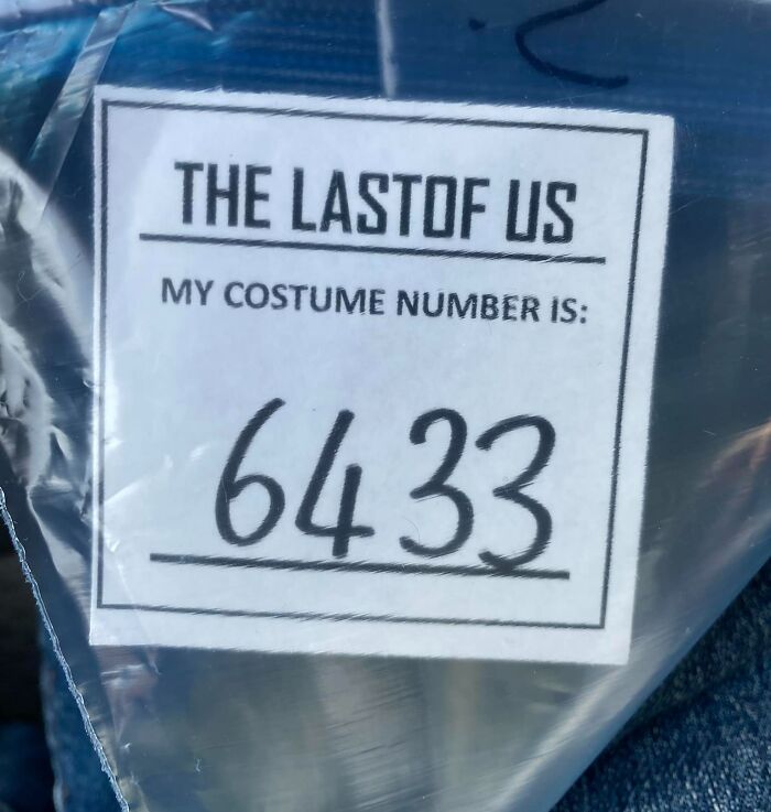
Image credits: Spencer Stevens
#61 Whotels
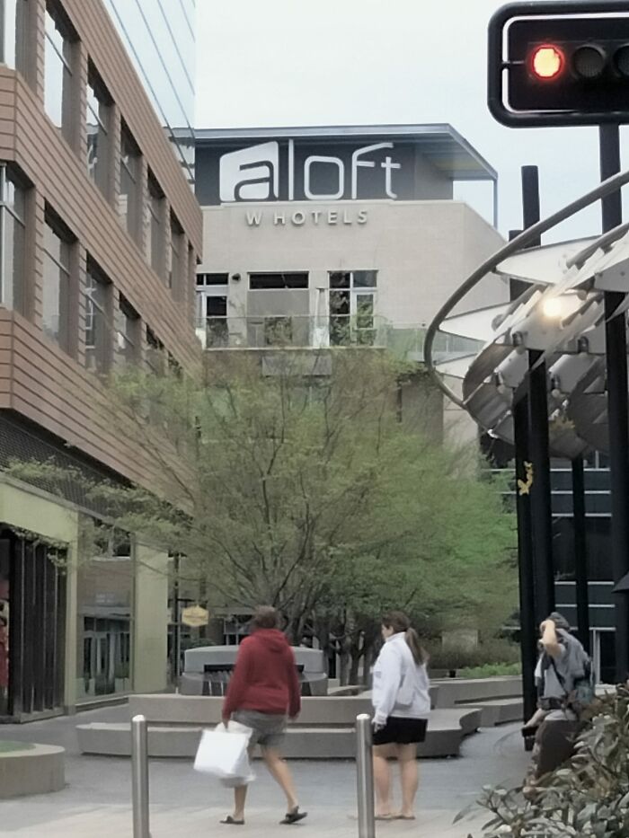
Image credits: Bethany Thomasson
#62 From One Of My Child’s Books From School. If Only Ben Jamin Franklin Would Have F Ound A Way To Improve This Keming
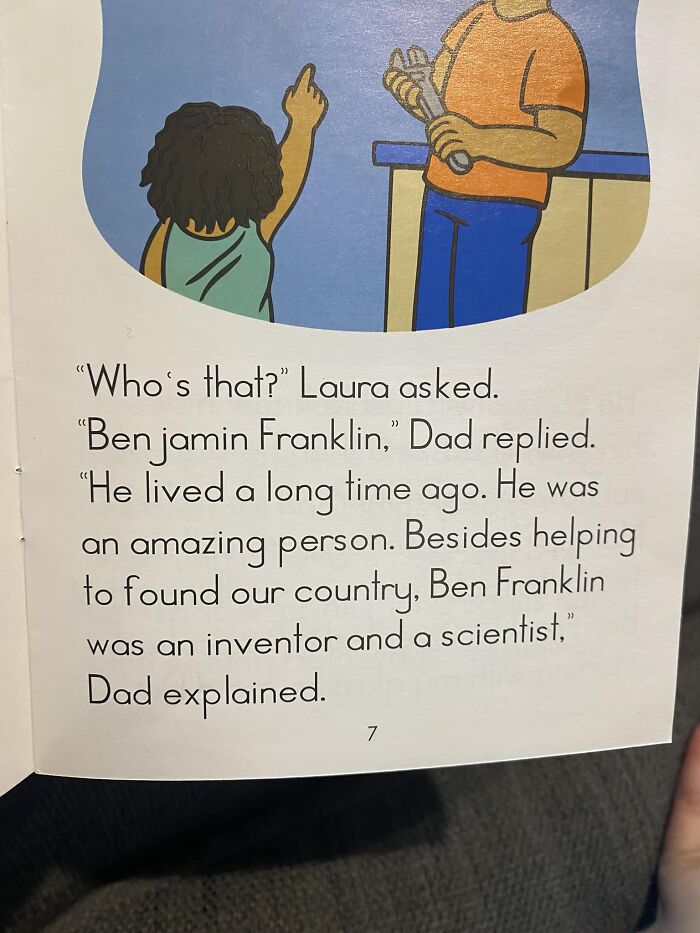
Image credits: Cindy Steele Agee
#63 "We Can't Make It Any Tighter!" "Do It Anyway!"
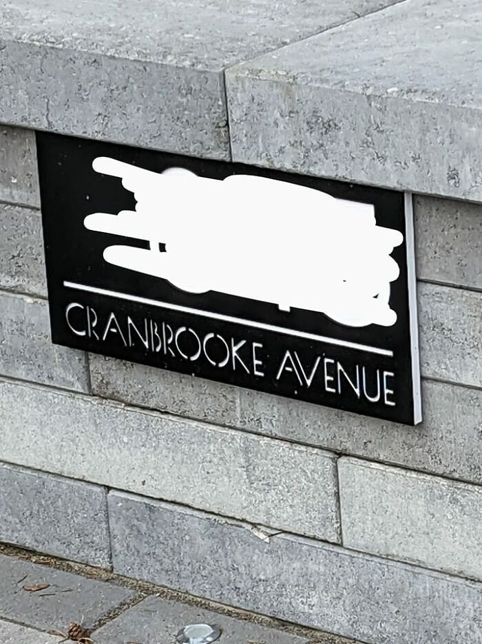
Image credits: Helen Hewetson
#64 Axe Body Spray End Cap Display At Walmart
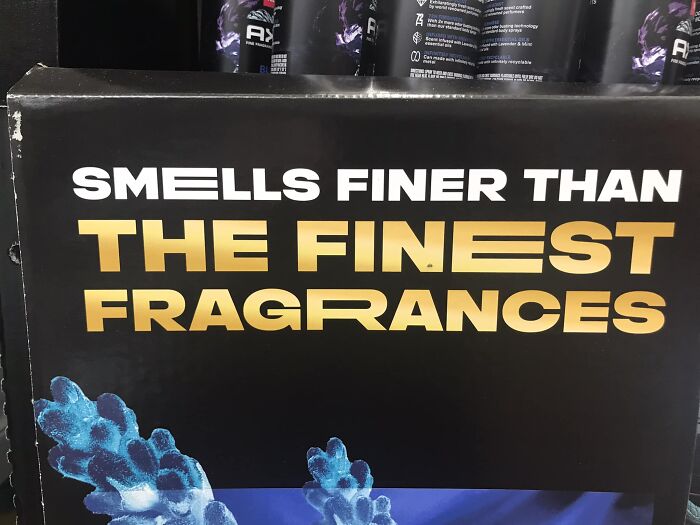
Image credits: Michael Bodary
#65 The Spacing, The Backwards Letters Scattered Throughout. It’s All Just A Mess
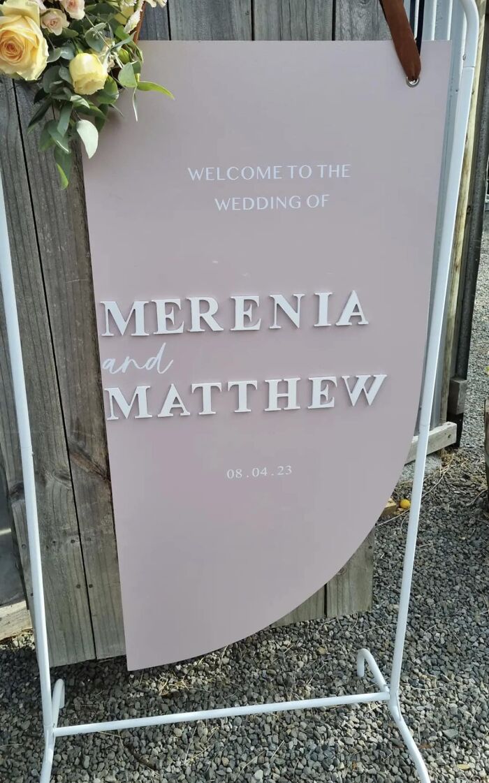
Image credits: Group member
#66 I Hate The Way The Letter 'H' Looks, Too. Can't Stop Seeing A 'Ђ'
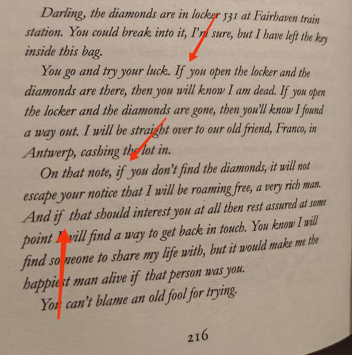
Image credits: Nevena Momirov
#67 Received This At A Breast Cancer Survivors Dinner. Appreciate The Sentiment, But I Will Always See Adjust, Brethren!
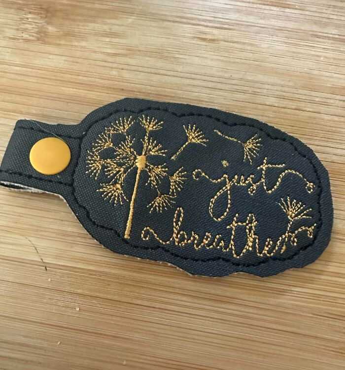
Image credits: Mary Becker Cunningham
from Bored Panda https://ift.tt/hGR0qt1

