


Paula Scher, one of the most influential graphic designers of our time, once uttered those words in reference to design. And while I’m sure she was being honest, I think some designers really took those words to heart and somewhere along the way abandoned the “getting good” part of their plans.
Below, we’ve gathered some of the most atrocious examples of design that have been shared on this subreddit that’s dedicated to roasting terrible design. From signs that induce headaches just from trying to read them to ovens that melt their own knobs, apparently, there are plenty of bad designers out there who need to grow a bit (or a lot) before they start producing excellent work.
Be sure to upvote all of the photos that make you want to fire a designer somewhere out there, and let us know in the comments what the worst examples of design you’ve ever seen were. Keep reading to also find an interview we were lucky enough to receive from graphic designer, writer and the man behind Identity Designed, David Airey. Then if you’re interested in checking out even more examples of horrific design, you can find some of our previous articles on the same topic here, here and here.
#1 My Local University Has A Number Of Human Sculptures On Roofs Of High Buildings, Often Mistaken For Real People
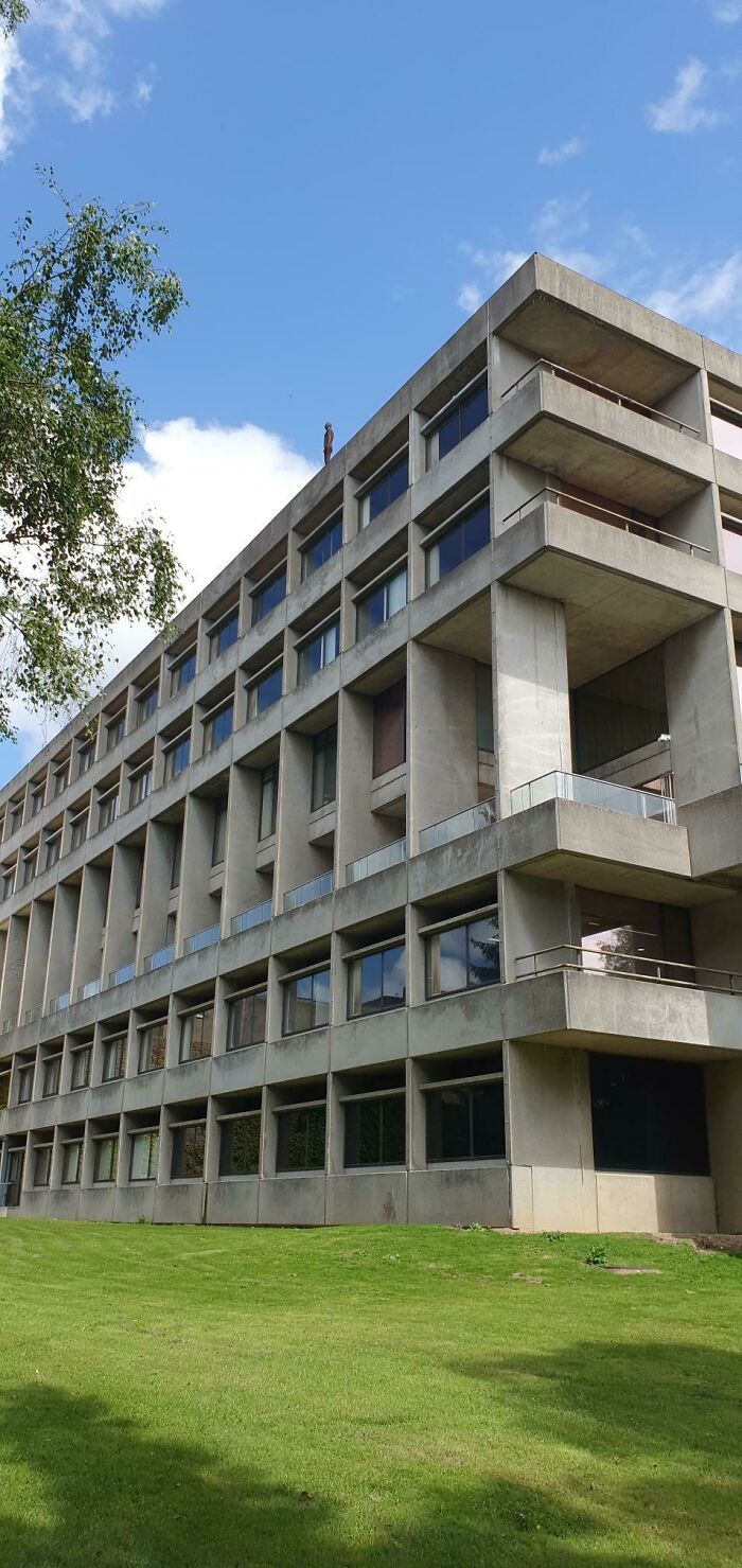
Image credits: Cupfeet
When you're used to seeing products, buildings, packaging, websites and more that have actually been designed well, it's easy to take beautiful design for granted. But when you realize just how much terrible design there is out in the world, you start to understand how valuable great designers are. The Bad Design subreddit, which is dedicated to calling out examples of awful design, has over 3 million members who are constantly sharing all of the poorly designed items and spaces they come across in the world. From public bathrooms that have absolutely no privacy to labels on products that look extremely unappealing, it's hard to believe that all of these awful designs were actually signed off on.
But don't let this list make you lose faith in the designers of the world; there are plenty out there making the world a more efficient and aesthetically pleasing place too. Their work just won't be shared on this particular subreddit. To gain some insight from one such designer, we reached out to graphic designer, writer, and brand consultant David Airey. First, we asked David why good design is so important. “Your visual identity should reflect the quality of what you sell, otherwise there’s a disconnect between what people see and the impression you want to give,” he told Bored Panda.
#2 1 Person Is Ok, 2 People Is Ok But In Red
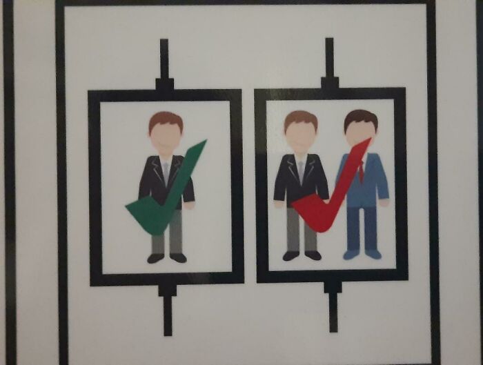
Image credits: Luis008_
#3 Uh... Fearsome? Roarsome? Rfarsome?
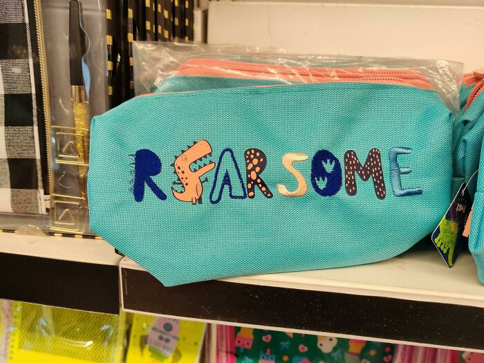
Image credits: king_27
“A thoughtfully designed identity is an investment that, when combined with an excellent product or service, gives a return year after year. It can help change potential buyers into loyal customers,” David explained. “A good identity should be simple enough in appearance to be easily recognizable, yet distinctive enough to separate from the competition. It should also be appropriate, because if it looks out-of-place within the market then people will be less likely to trust what’s being sold.”
In addition to focusing on his own work, David also runs a site called Identity Designed, which he describes as “a small way to showcase respected work from around the world”. “The website led to an approach from Rockport to write an accompanying hardback (a bestseller in Amazon’s branding category),” David shared. “In the words of Adobe’s principal designer, Khoi Vinh, it’s ‘not just a beautifully designed book, but also beautiful in its depth and detail about the identity design process’.” If you’re looking for a palette cleanser after viewing this list of bad design, I highly recommend checking out Identity Designed’s website; it’s full of pure eye candy.
#4 Photoshop vs. Reality?
Image credits: misswooster22
#5 This Playground Is Built In A Hole And Fills With Water When It Rains
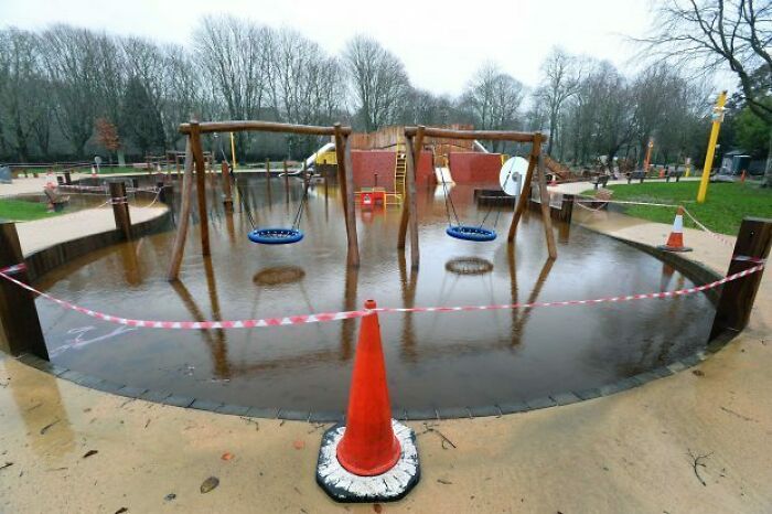
Image credits: iitc25
#6 Couldn’t Figure Out Why I Kept Grabbing The Wrong Size Out Of The Multipack Box… Then Realized All 3 Sizes Come In All 3 Colors!
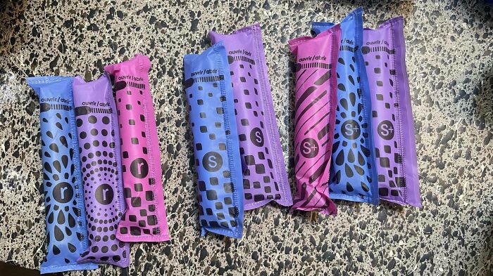
Image credits: facemymusic
We also asked David what the most important factors to consider are when choosing a designer to work with. “There’s nothing more important than the portfolio,” he told Bored Panda. “But in addition, you get a sense of what people are like when you talk to them — whether they seem trustworthy, easy to communicate with, genuinely interested in doing the work. Talking to a few designers before choosing one is always worth the time.”
We then asked David if he could share any examples of particularly bad design that he’s seen over the years. “The Tropicana packaging redesign from some years ago is a good example of design having a negative impact,” he noted. “When the new cartons were put on shelves, customers couldn’t recognize them and sales were hit hard. So the company reverted to the previous design. That would’ve wasted a ton of money, not just in sales, but in meetings, and tooling, and production time.”
#7 If Only There Was A Letter In Flame That Could Resemble A Flame
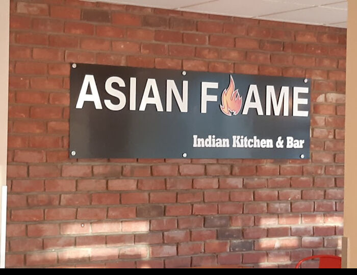
Image credits: dickb0tt
#8 Not Sure The Cover Artist Read The Book?
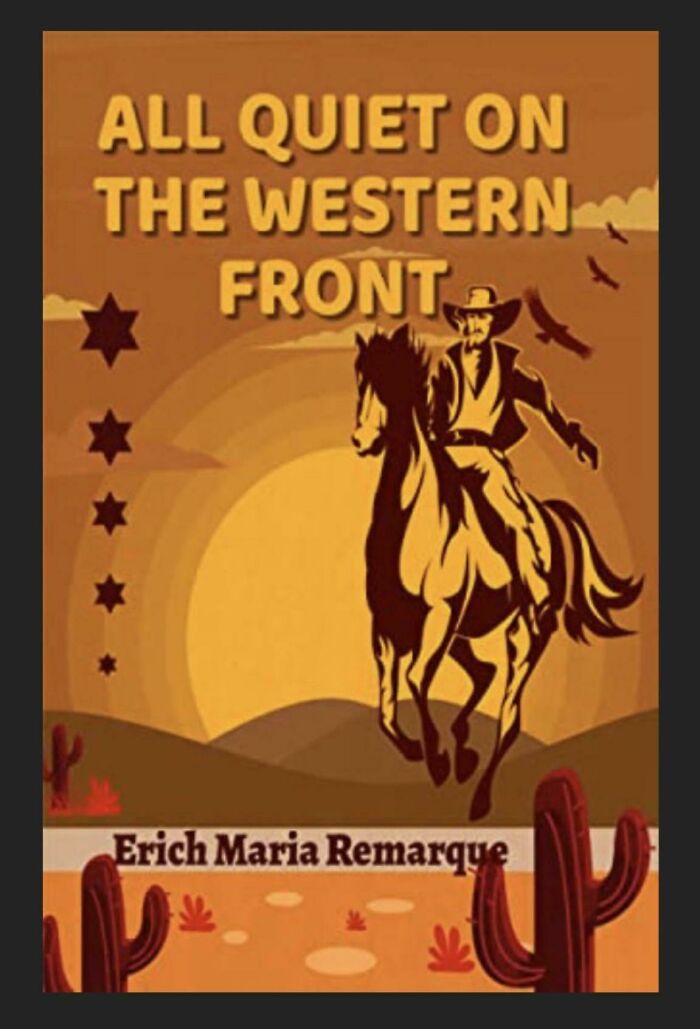
Image credits: LWYPLTDG
#9 Stanley Measurement Tape With Size Of The Roll Described In Inches And Tape In Centimeters
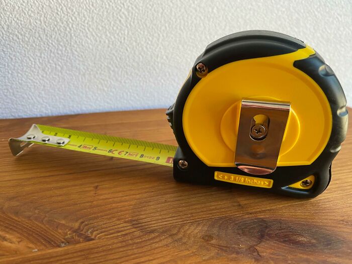
Image credits: Dark_Charmander
“Most people choose what they’re familiar with, so any design change needs to be respectful of brand equity,” David explained. “The old PriceWaterhouseCoopers logo always seemed a bit of a car crash, with the letters bunched together at different heights, fresh from colliding,” he added.
“I love a good logo, and some of my favorites include Paula Scher’s H monogram for the Highline, Paul Belford’s forward-pointing book for New Chapter, Magpie’s playful mark for Bandido, and the late 300million’s symbol for The Guild of Food Writers,” David says. He also noted that he’s shared these, among other examples of great logos, in a series on Logo Design Love that you can find right here.
And if you’re looking for even more examples of satisfying design, be sure to check out David’s portfolio right here.
#10 Very Confused Messaging. Why Strike Out The Part That Leaves It Meaning The Same?
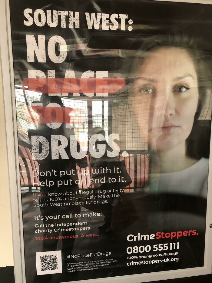
Image credits: EvilDMMk3
#11 What Was Wrong With Blue Water?
Image credits: Dere_Dere
#12 God Is Goo.
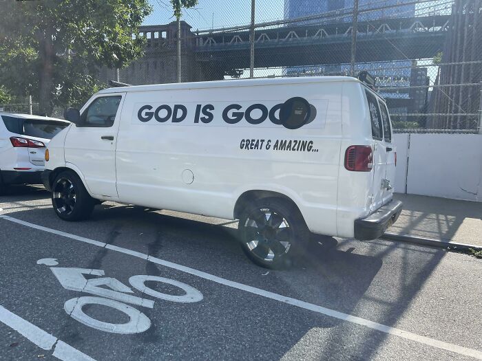
Image credits: tigho
It’s easy for us to hate on terrible design that we see out in the world, but would we actually be capable of creating anything better? Clearly, being a designer is not the simplest job in the world, so we consulted this article from Rasmussen University to hear from real graphic designers what they think the most challenging aspects of the job are. For one thing, designers apparently often have to deal with feedback that is not very conducive to their process. “You're going to have clients who have feedback— sometimes that feedback will go against rules of design and may make a design worse,” says designer Levi Olmstead. But if a client is paying for you to make a sign in Comic Sans and they won’t listen to your advice as a professional, you might sometimes need to compromise. Just make sure the design doesn't get so bad that it can end up on a list like this.
#13 Feel Like This Airline Overestimates The Danger Of Rogue Origami Birds
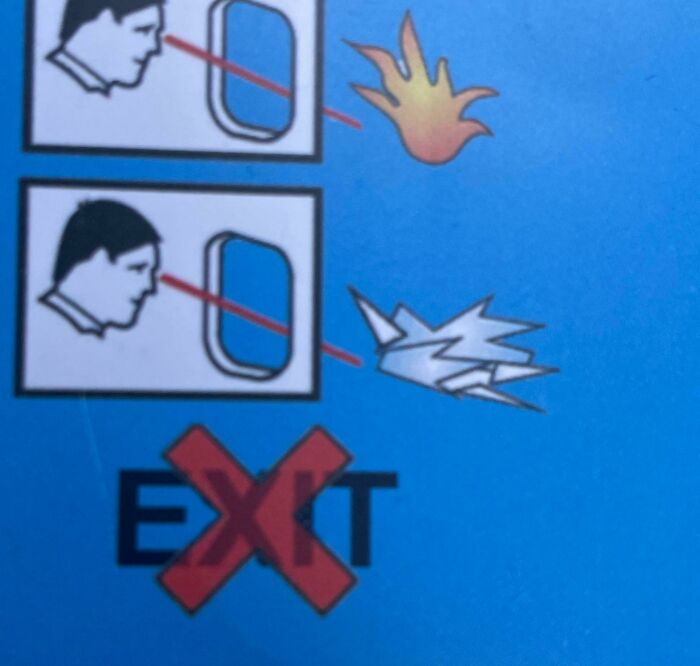
Image credits: Zealousideal_Emu_493
#14 Chilled Juice & Kids
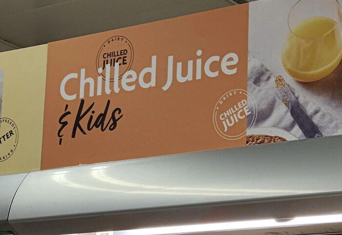
Image credits: shaquille_oatmeal911
#15 The Almost Never Ending Airport Directional Sign.
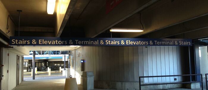
Image credits: TrevorAlan
Another struggle graphic designers often face is creative burnout. “I don’t care how long you’ve been designing, the burnout stage will happen at some point,” says graphic designer Nick Avola. “New designers need to be prepared. Your creativity has limits. You need to care for and replenish it—otherwise, your process will become mechanical and emotionless, and the final products will suffer.” Avola says that sometimes designers need to pass on work to give their brains a break, but it will be worth it in the long run. Burning out can be detrimental to your creative process and your mental health.
#16 Not Sure Who's Allowed To Park Here
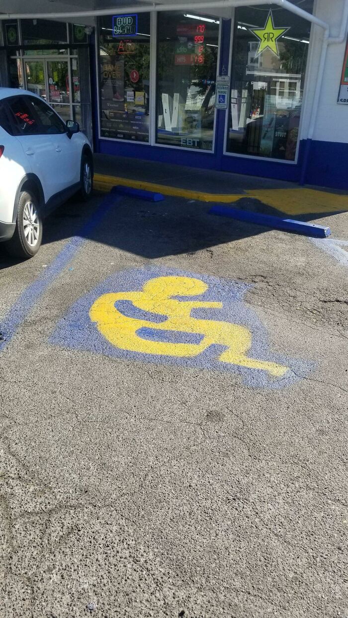
Image credits: Kowboooy
#17 A Catalog For A Clothing Company I Once Worked At. How Was This Cover Ever Approved?

Image credits: Taste_of_Natatouille
#18 Are You 25 Feet Tall, Own A Multimillion Dollar Yacht And Want To Hand Wash Your Yacht Fully Clothed While Out To Sea? We Have An Inflatable Dock For You!
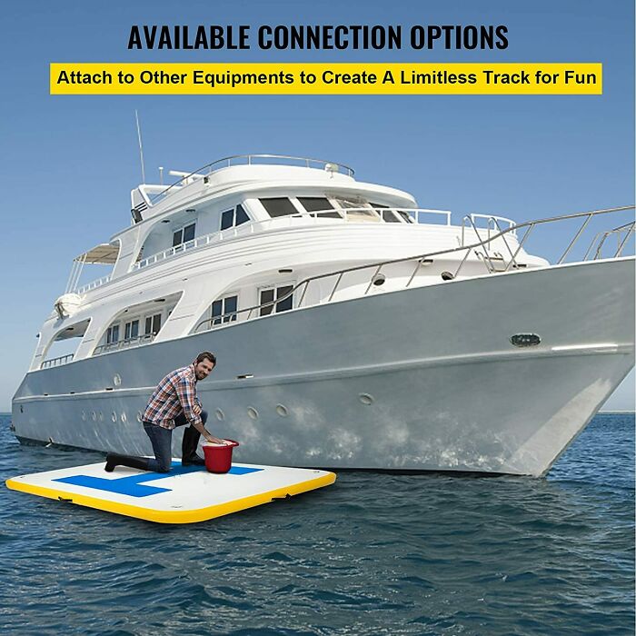
Image credits: Vincenzo77
Contrary to what some of the posts on this list may lead you to believe, breaking into the field of graphic design can be quite challenging. There may be plenty of graphic design jobs out there, but very few of them are entry-level. (And we all know that companies nowadays often advertise positions as “entry-level” then slip in the fact that 5+ years of experience are needed.) According to Flat Icons, there are a few things upcoming designers can do to help land jobs (and possibly prevent terrible designers from snagging those same positions). The first tip they recommend is making your portfolio shine. It should only showcase a designer’s best work, and it should be tweaked when applying for jobs to feature what is most relevant.
#19 The Best People Are Who People To Eat
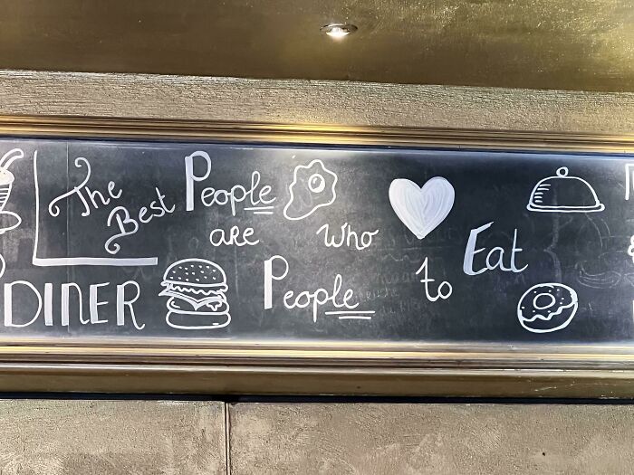
Image credits: annaanzi
#20 Terrible Sign Color Choices
Image credits: bobwithlobsters
#21 The Ad Literally Says, "Modern Kitchen, Great Layout, Bright And Spacious!"
Image credits: mercuryrising137
Graphic designers should also be promoting their work everywhere. “Getting your work seen on the web is a great place to start,” Flat Icons notes. “You can share your projects on specialized networks like Behance and Dribbble, or with your friends and followers on social media. Many potential clients visit these websites when looking for graphic designers, so learning how to build a strong online presence is very important.” It’s also recommended for designers to take freelancing jobs when possible, especially when trying to build their portfolios and gain confidence in their work.
#22 Why Would You Do This?
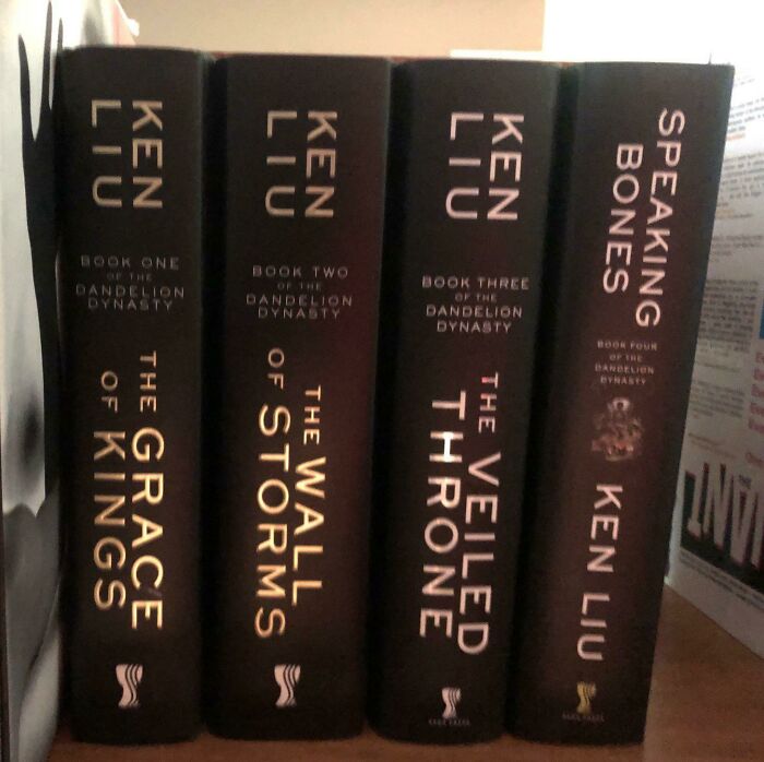
Image credits: AlephMartian
#23 Don't Go With, Fight It, The Flow
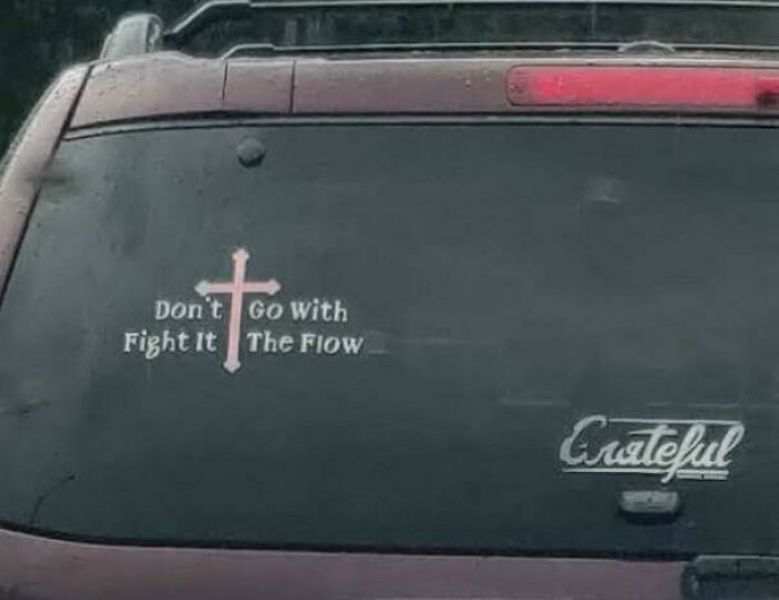
Image credits: Kubik_Cuts
#24 Oven Vents Directly Onto The Knobs, Making Them Discolored And Burning Hot To The Touch.
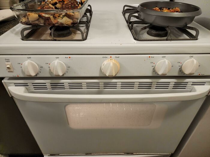
Image credits: Periphery755
Graphic designers can also work on building a strong peer network to help one another get jobs. Not everyone is perfect for every opportunity, so it can be very useful to have others looking out for jobs that they can pass your way when you would be the perfect fit. Unfortunately, bad design can sometimes come down to a designer just not being right for the project. But if you have a community of skilled designers around you, you can all help one another grow and gain feedback from individuals that you trust in the field.
#25 I Spent Half My Meal Trying To Decipher This
Image credits: InspectorGoole
#26 Who Wants A Nice Cold Formaldehyde Beverage? Someone Didn’t Think That Chemical Formula Through…
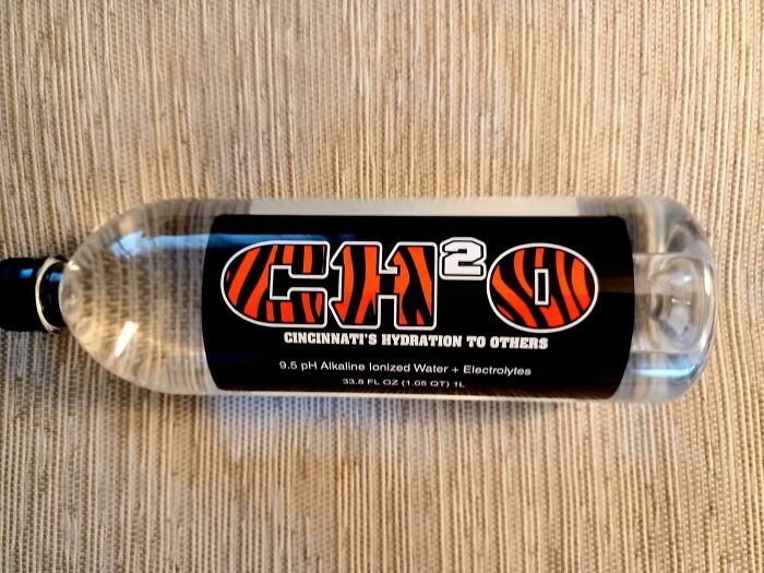
Image credits: kalitarios
#27 R Is For ?
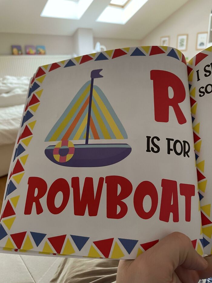
Image credits: scstraus
Are you suddenly feeling like you have what it takes to be a designer? We hope you’re getting a kick out of these examples of terrible design and that you’re not cringing too hard. Keep upvoting the pics that you find most amusing, and feel free to let us know in the comments what the worst examples of design you’ve ever witnessed were. Then if you’re interested in checking out even more design fails, you can find some of our previous articles featuring the same subreddit here, here and here.
#28 Investing Ad Shows A Picture Of A Negative Return Rate
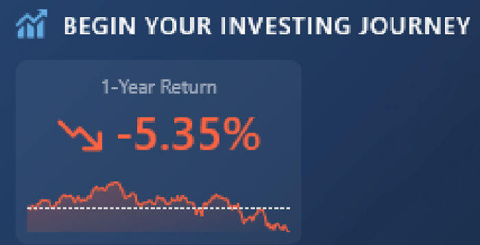
Image credits: SirBorf
#29 Supposed To Be Finally 21 But Spacing Makes It Looks Like A 12
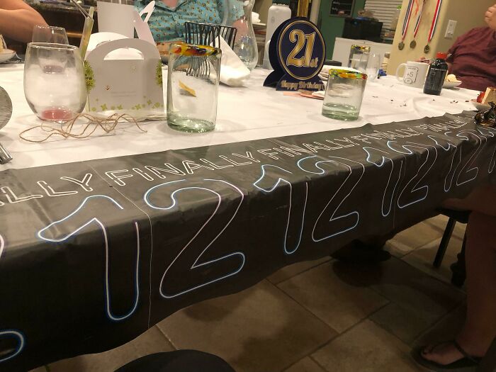
Image credits: Shadowpilot6
#30 Slip And You’ll Break Your Neck Going To The Basement To Do Laundry At My Apartment Building
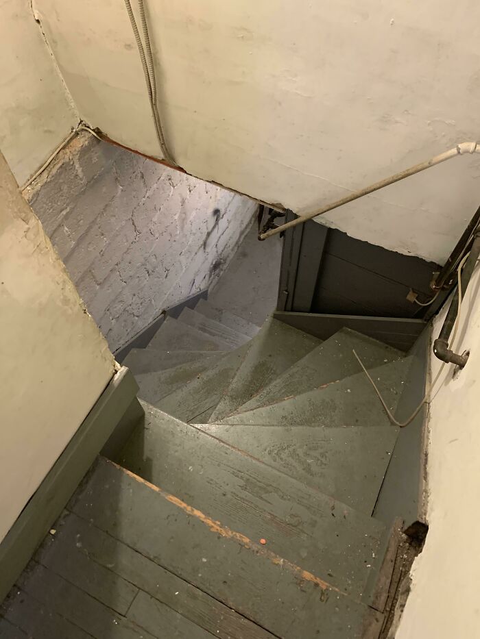
Image credits: Rargmas
#31 Was Hit In The Ass Taking A Leak
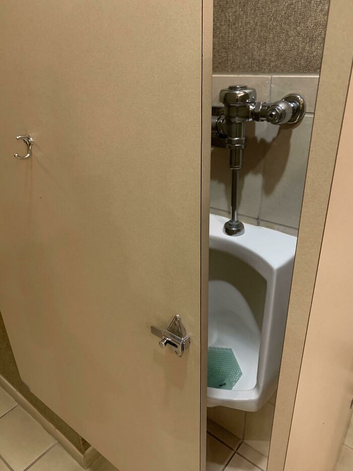
Image credits: KingNeptune767
#32 This Ad In My Print Copy Of The New Yorker
Image credits: crispytacofan
#33 Happy Birthday Ha
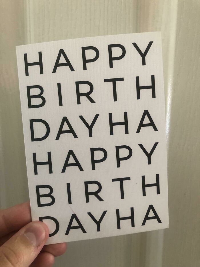
Image credits: fliberdy
#34 Missed Opportunity For Using The Jesus Statue As "T" Rather Than "I", Which Would Be More Readable And Intuitive
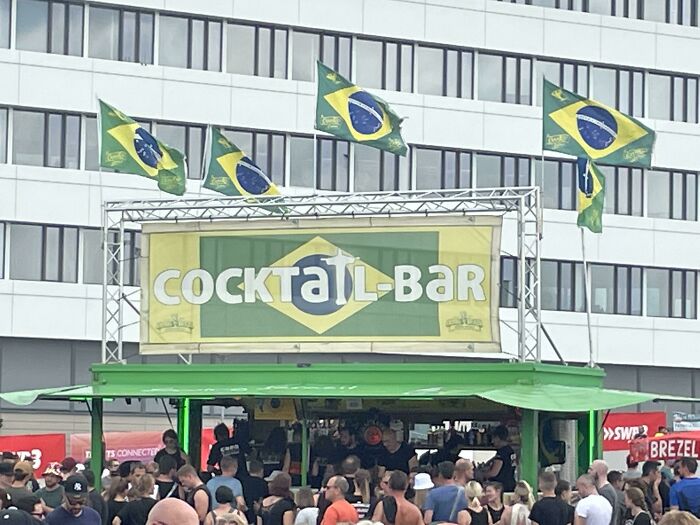
Image credits: furbz1
#35 7ft Pool Holds An Entire Family. (Legs Not Included)
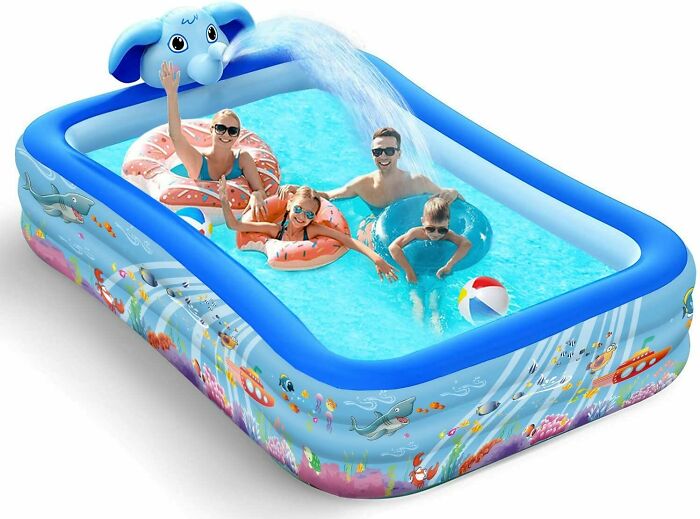
Image credits: CallPhysical
#36 Dont Mess With Chile ??
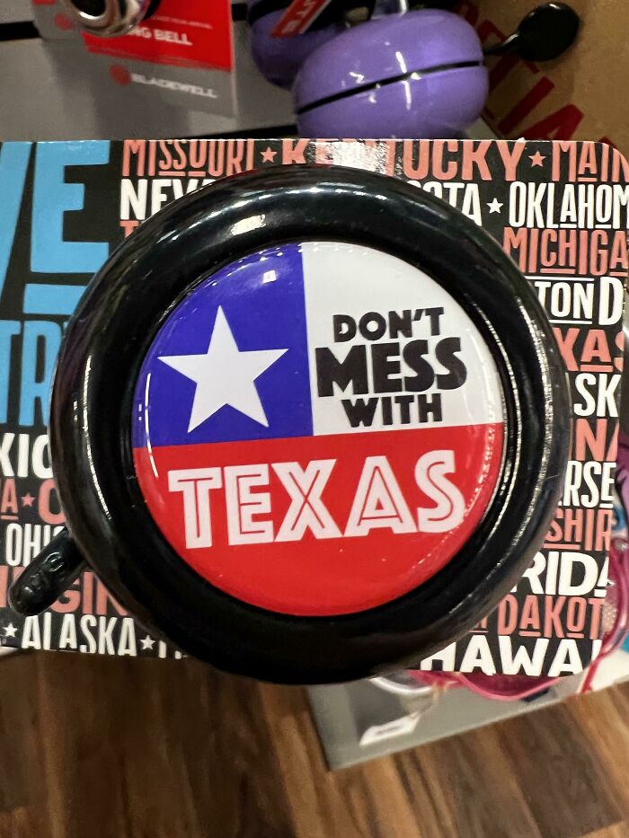
Image credits: wotwud
#37 The Photoshopped Beer Is Worse Than The Actual Product (Being Poured Into Coca Cola Cups)
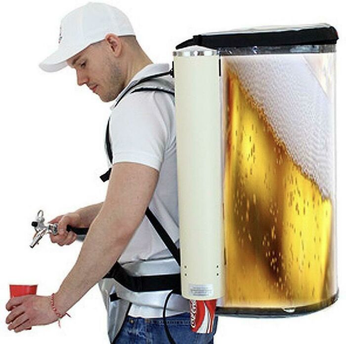
Image credits: Tacklefina
#38 From A Baseball Stadium That Took 1.2 Billion Nt Dollars To Build, This Sure Exceeds The Expectations
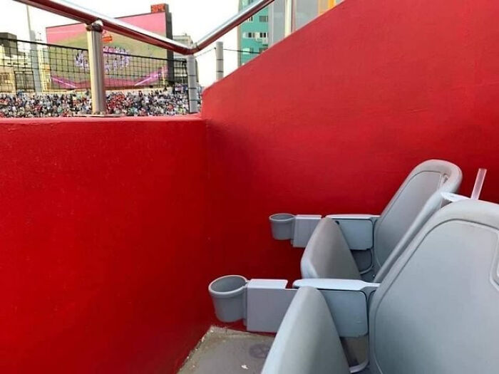
Image credits: hofong159
#39 Parcours For Wheelchairs…
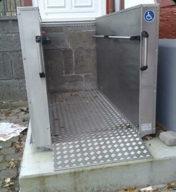
Image credits: FireIceWizard
#40 This Is Death Waiting To Happen
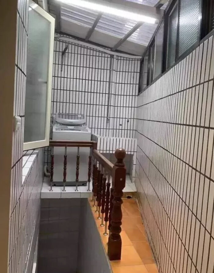
Image credits: hofong159
#41 This Chicken Cookbook Has An Index Entry For Chicken
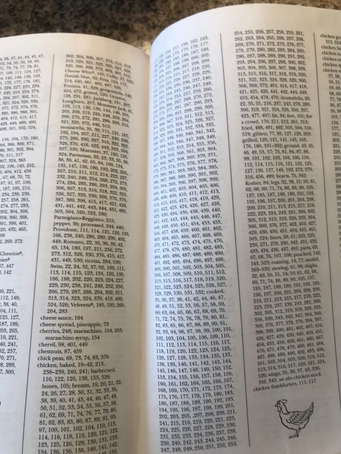
Image credits: FloppyTunaFish
#42 It Just Looks Depressed
Image credits: GeneralJAW
#43 The Sign On This Coffee Shop Is Terrible. I Can't Even Read The First Word. I Can't Imagine They Thought This Through
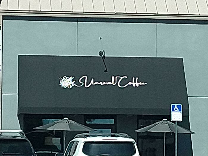
Image credits: leathebimbo
#44 I Think It’s Trying To Say Dumbo
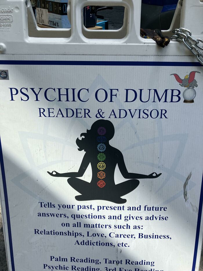
Image credits: comfychair_4444
#45 “No Farting On Pregnant Women”
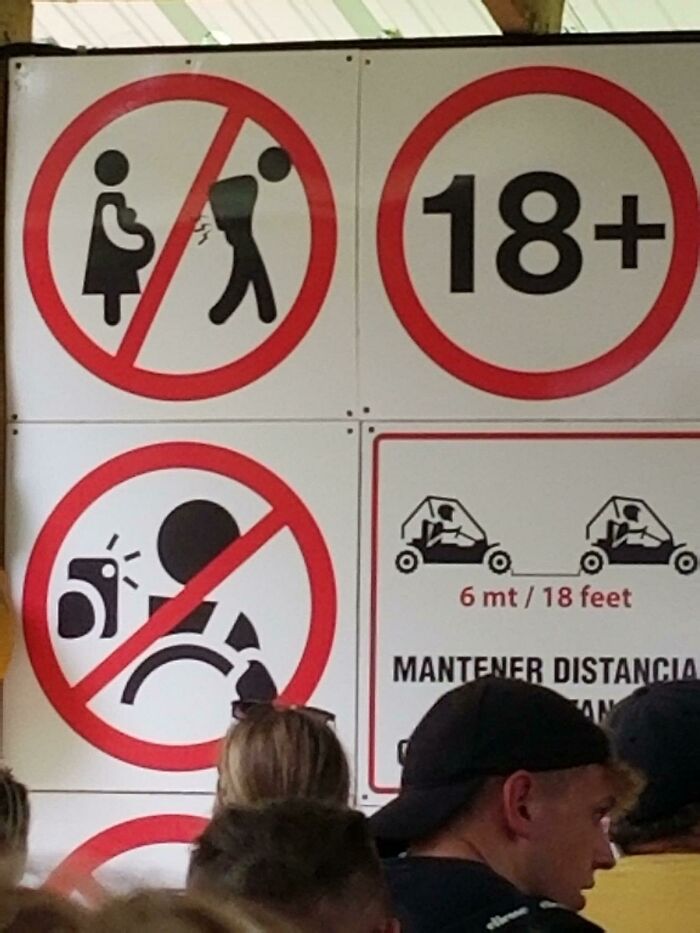
Image credits: brhiebner
#46 You've Seen Crappy Elevator Button Designs Before. Get Ready For The Crappiest Elevator Button Design You've Ever Seen
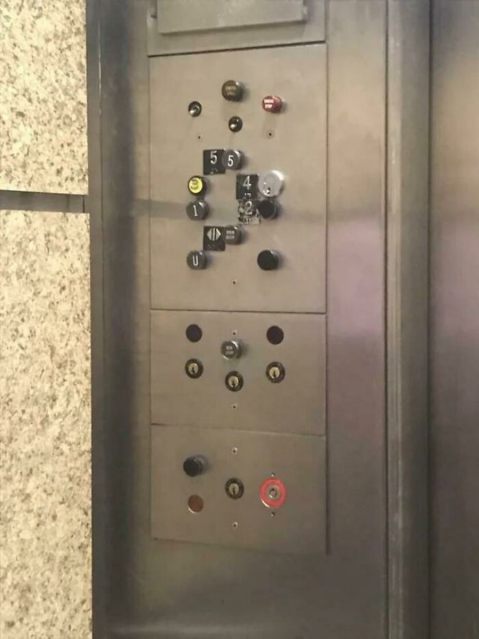
Image credits: AdhesiveHelplessness
#47 A Bench That Doesn't Drain
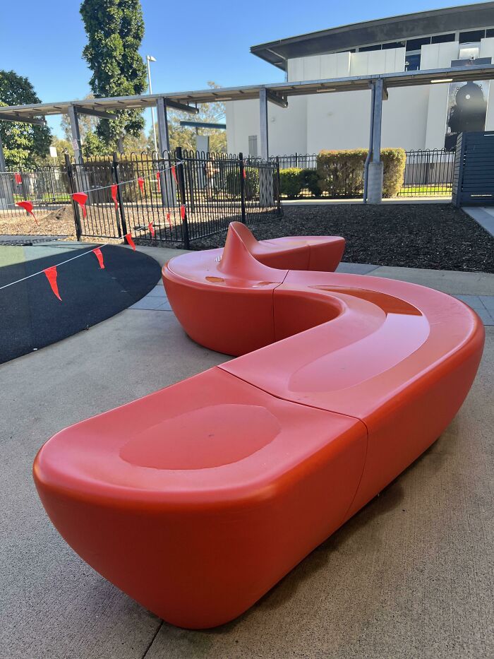
Image credits: crf865
#48 The Shadows Of The Numbers Are In A Different Font Than The Numbers Themselves
Image credits: GHarold101
#49 We Have To Decode What The Shirt Says
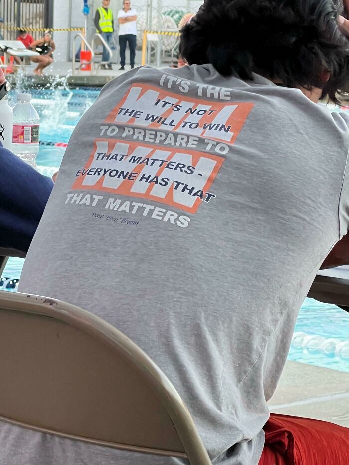
Image credits: Insomnicwriter
#50 Urinals At An International Airport
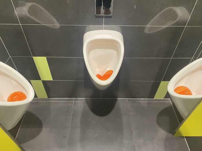
Image credits: geisterpfeife
#51 Don’t Smoke The Propane!
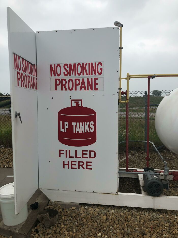
Image credits: Adorable-Display-676
#52 Stair Blocks My Cabinet
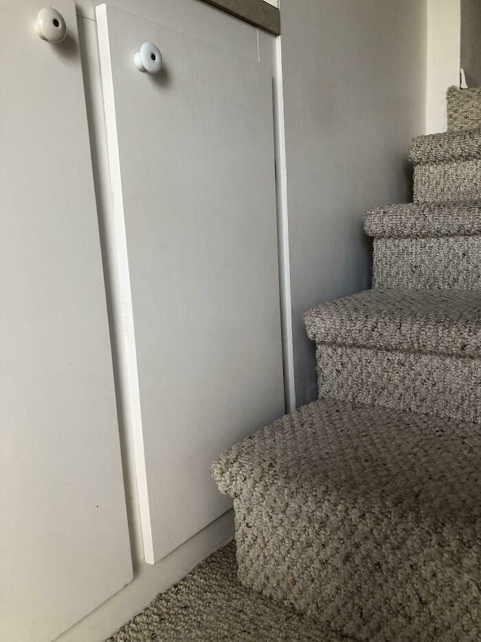
Image credits: That_Pug_Guy
#53 Cross Post From R/Design, Asking For The Font Name. They Were Roasted In The Comments
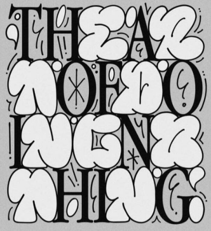
Image credits: PurpleLoon
#54 At First Glance I Thought The Can Was Badly Rusted. Turns Out It's Part Of The Graphic
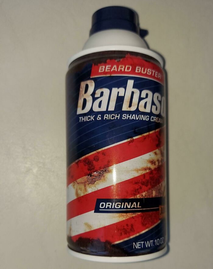
Image credits: RespectMyAuthoriteh
#55 I Tutor Esl Kids, And This Is The Worksheet I Was Given To Use. The Clip Art Was An Instant Red Flag, But It Got So Much Worse.
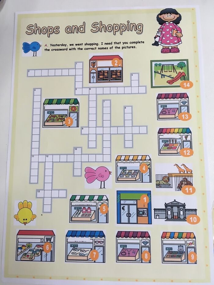
Image credits: thecatinthemask
#56 Terrible Font On This Musical Festival Announcement
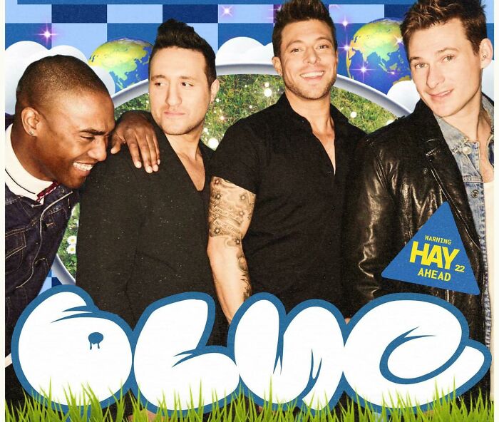
Image credits: AtomicPhantom7
#57 Brace For Inter Wwith?
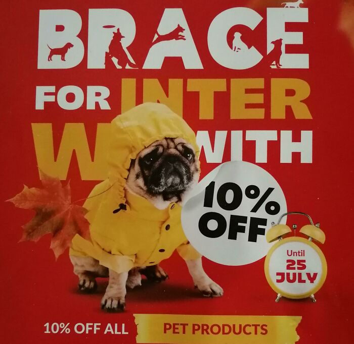
Image credits: SurrealOrthodox
#58 The Cup That Nibbles Your Lip With Its Little Teethies
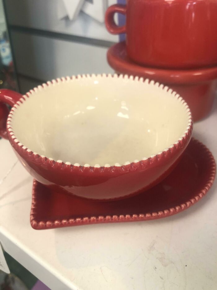
Image credits: SmolTownGurl
#59 A Fast-Food Place Signboard (With A Poor Choice Of Word Layout)
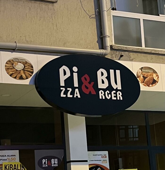
Image credits: tohajiile
#60 Face Cutouts At An Aviary
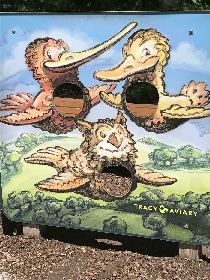
Image credits: NotJayGaming
#61 Just Don't Do It Correctly.
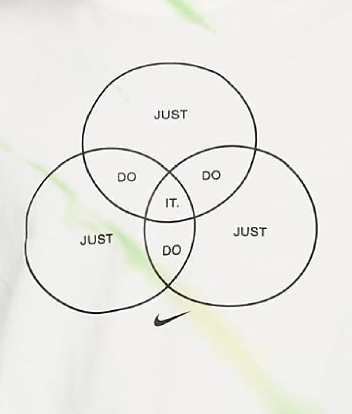
Image credits: Fatalstryke
#62 Small Town Tried To Make A USA Flag Design, But Got The Paint Job From The French Flag.
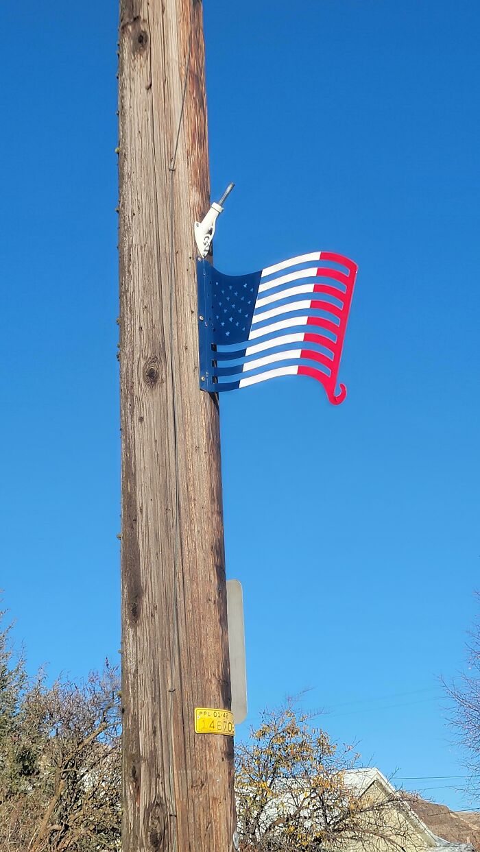
Image credits: rtp_oak
#63 Saw This Posted To A Community Page, Its Hideous
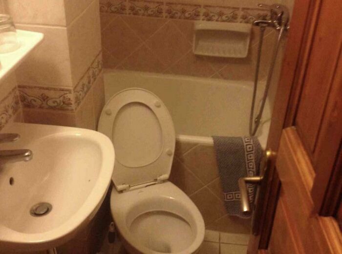
Image credits: BigSexlol
#64 Putting The Helmet On His Knee Makes It Look Like There Are 2 People In The Silhouette
Image credits: rex138
#65 This Carpet In A Hotel Elevator. It's Not Damaged, All The Hallways Are Like This Too
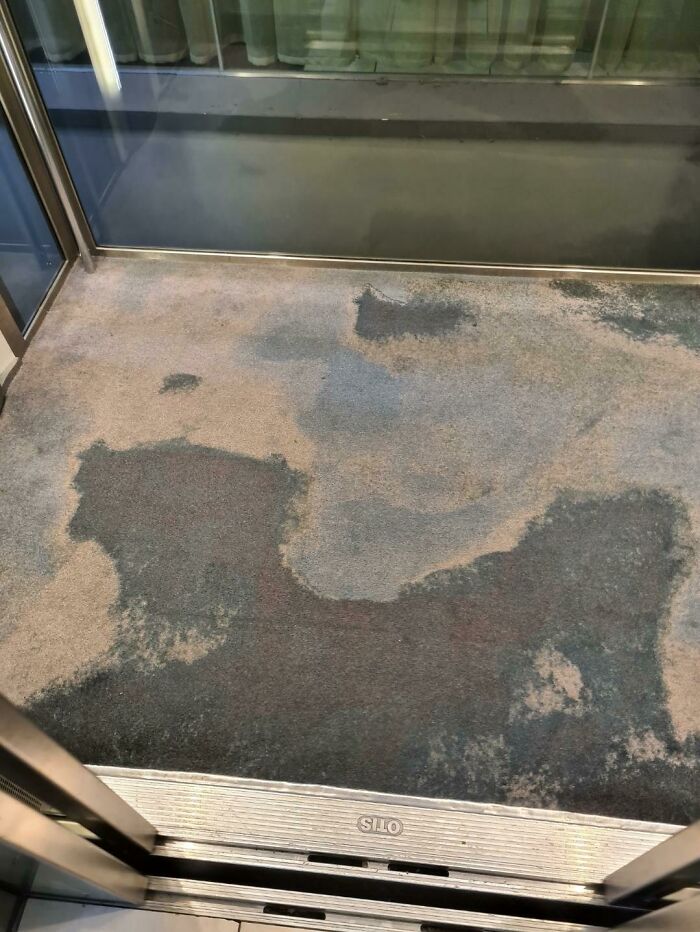
Image credits: Scutterbum
#66 Who Thought It Was A Good Idea To Put An Image Of 7 Churros For The Sign Of 3 Churros
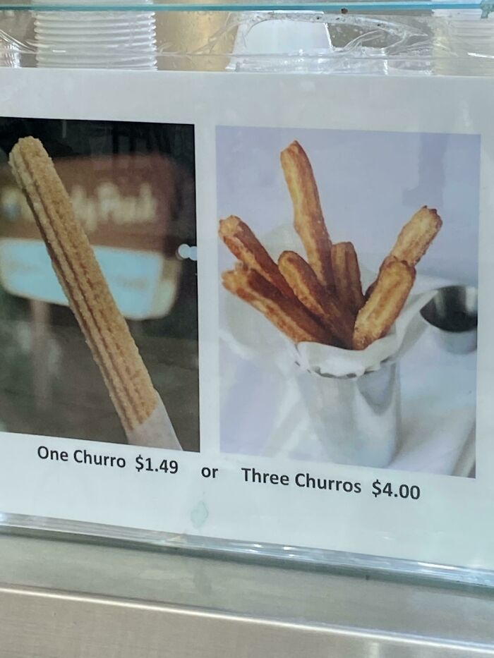
Image credits: lloverzo
#67 Unbalanced Pan… Only Stands Correctly When There Is Weight In It - Pretty Annoying And Even Dangerous With Hot Oil
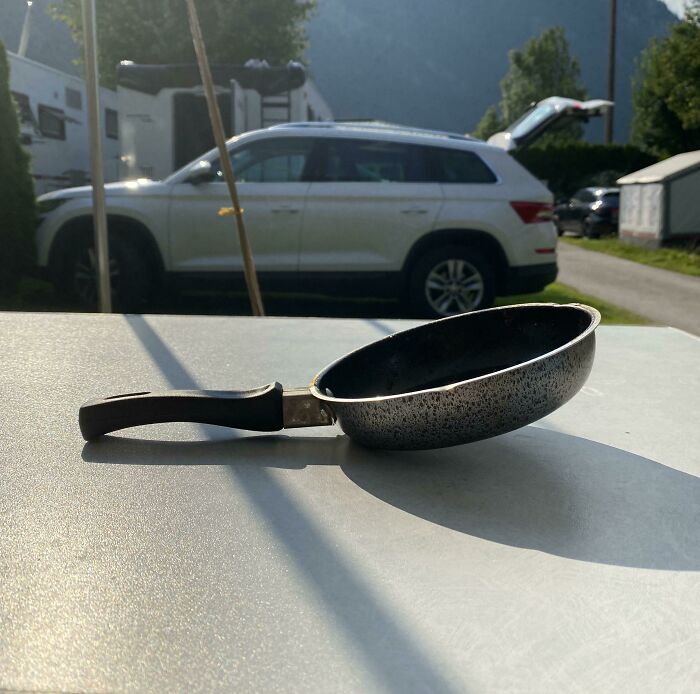
Image credits: fluppe-roochen
#68 A Chair With Closed Holes. So The Dust And Dirt That Enters It Stays !
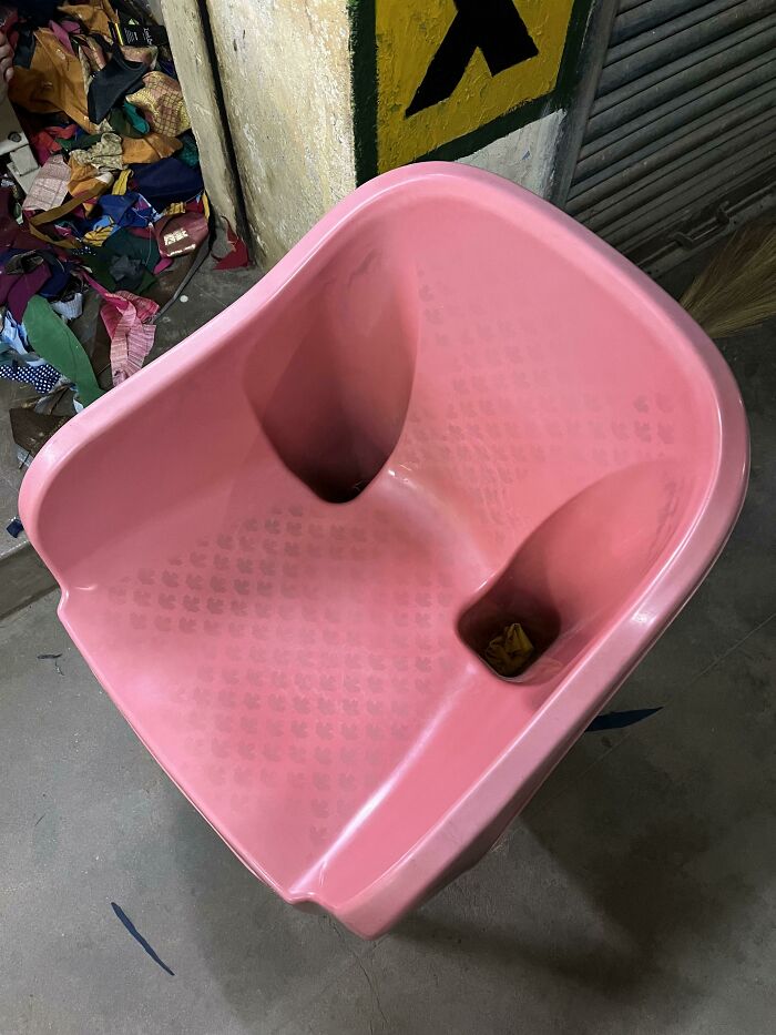
Image credits: Jeswin31
#69 My Baby Brother’s Play Mat Isn’t Correct ,or Is It?
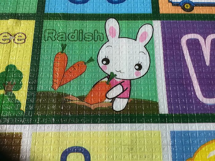
Image credits: Ray96598
#70 Not Sure Why They Flipped The Second M But I Guess “Masters Of Woisture” Works Too
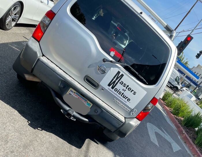
Image credits: Educational_Chip_554
#71 The Emoji Is Just Crying Red Tears Don’t Worry…
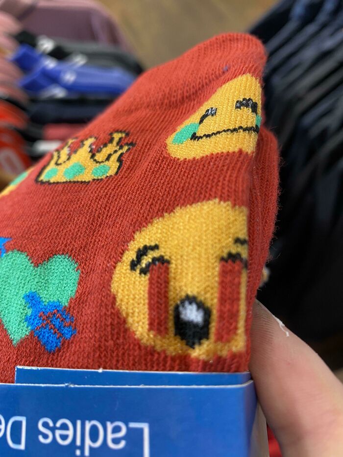
Image credits: SorleyOrSomething
#72 The Amount Of People Who've Fallen Down These Is Continuing To Grow
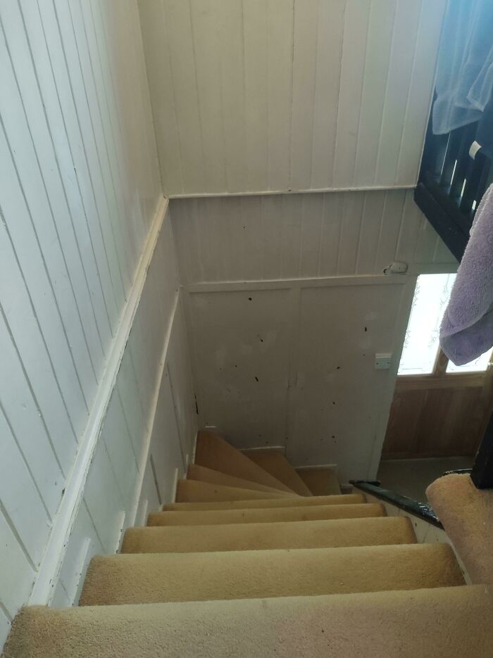
Image credits: sturgifur
#73 Super Thin Spoon That Turns To Spaghetti When Hot
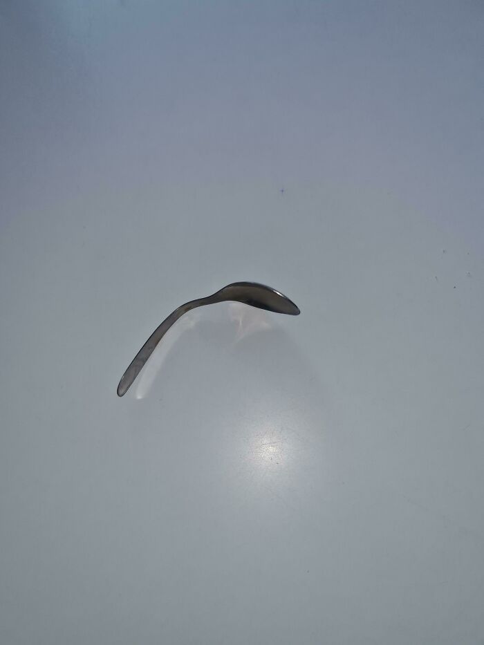
Image credits: llouisyoung
#74 I Don't Feel Very Beautiful Staring At That Logo
Image credits: Albafika
#75 A Beautiful Hardwood Bridge We Built At Work. Wheelchair Accessible. Comes With A Nice Steel Pole Almost Smack Bang In The Middle. This Is What Happens When Architects Refuse To Change Their Plan Even When Common Sense Says Let’s Move The Bridge
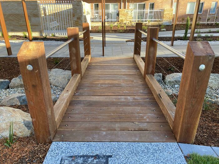
Image credits: BenignAndAHalf_
#76 This Doorhandle. I Don't See A Reason Why It Wouldn't Be Normal
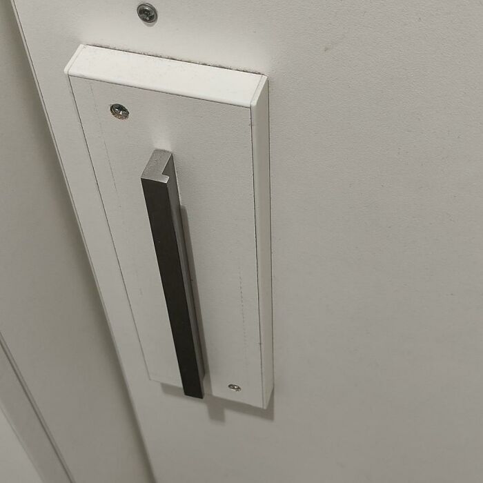
Image credits: TromMF
#77 Most Dos And Don'ts Are In The Wrong Columns
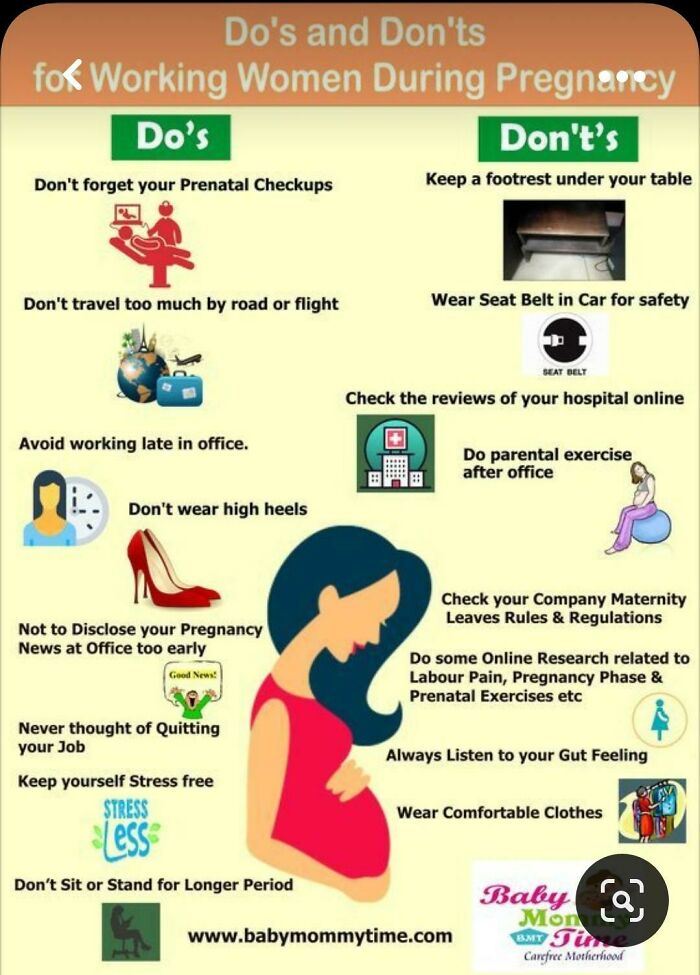
Image credits: Pink_Hair_Gamer_Girl
#78 Absolutely Beautiful Architecture Of The Place I Had To Piss In
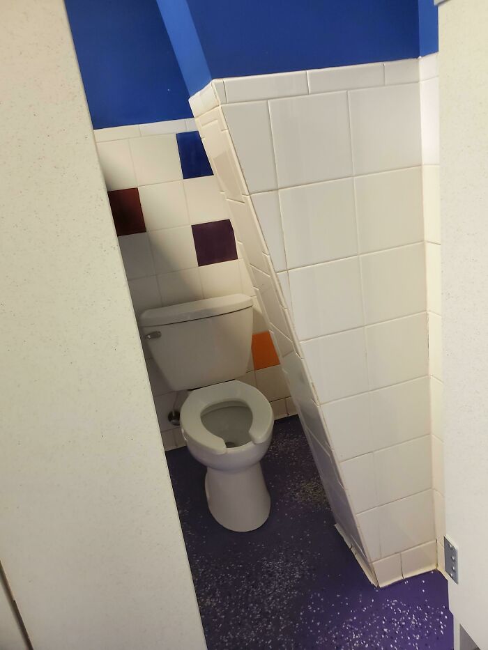
Image credits: Bettingflea95
#79 This Floor In A Shop I Was In Made Me Very Dizzy
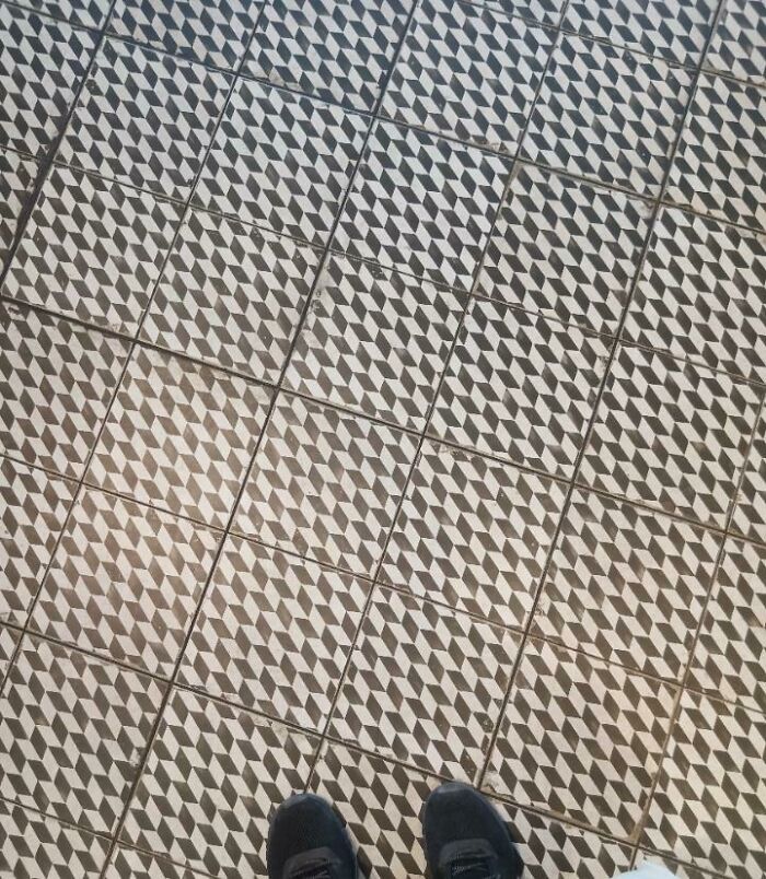
Image credits: QTVNickBro
#80 Insane Menu At An Insane Sandwich Shop
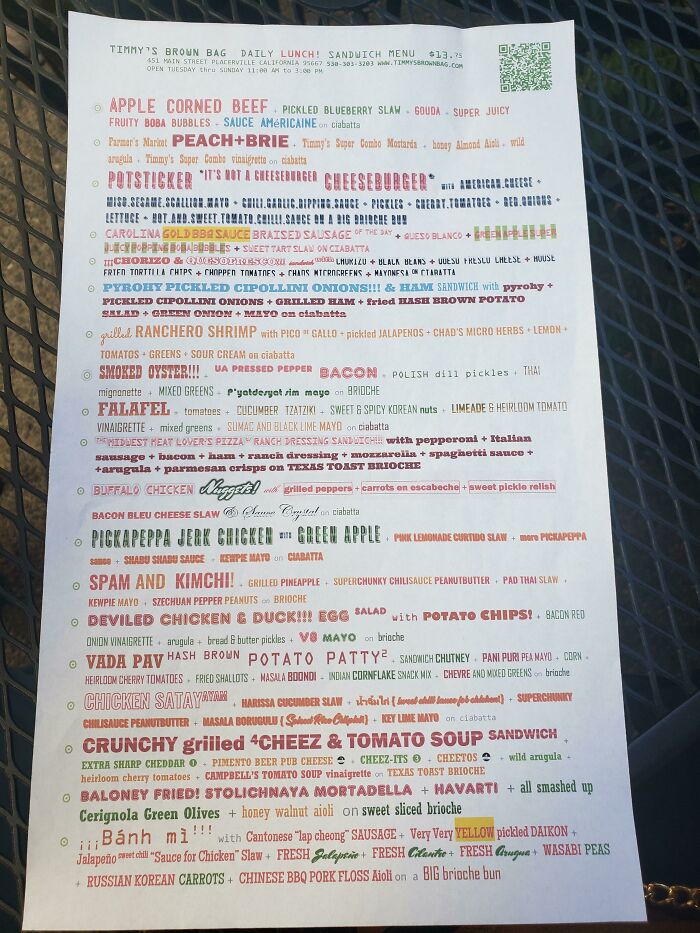
Image credits: Ultimichael
#81 Saw On Pinterest. Not Only Copy Pasted But They Look Upside Down As Well
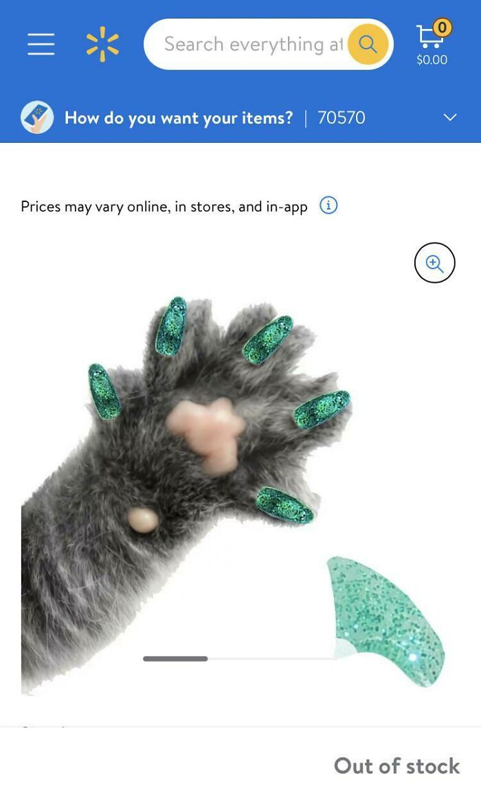
Image credits: Thewizardofstupid0
#82 Lets But Some Overpriced Icecream At This Nightmare Fuel
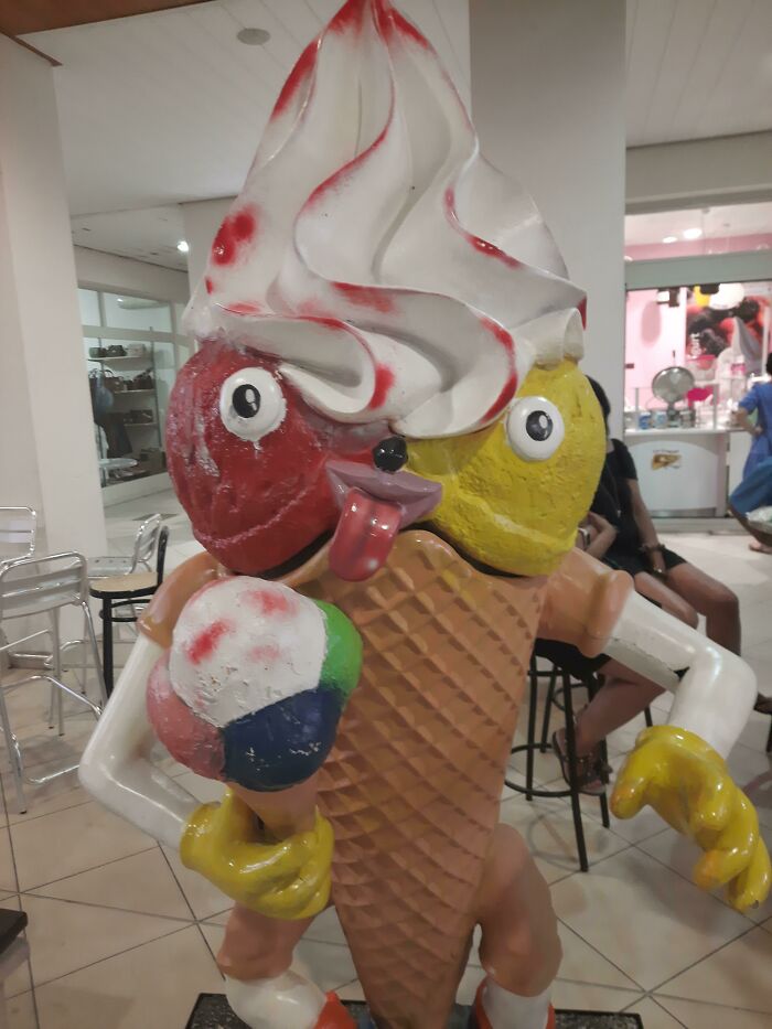
Image credits: sigaarbeer
#83 Interior Design Of This Bus
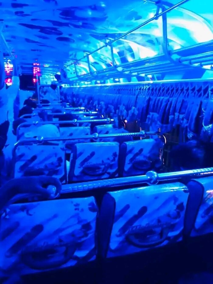
Image credits: Ehansaja
#84 This Awful Photoshop For A Slide I Saw An Ad For. Why Are They Wearing Normal Clothes In The Water? What The Heck Is Going On In The Background? So Many Questions!
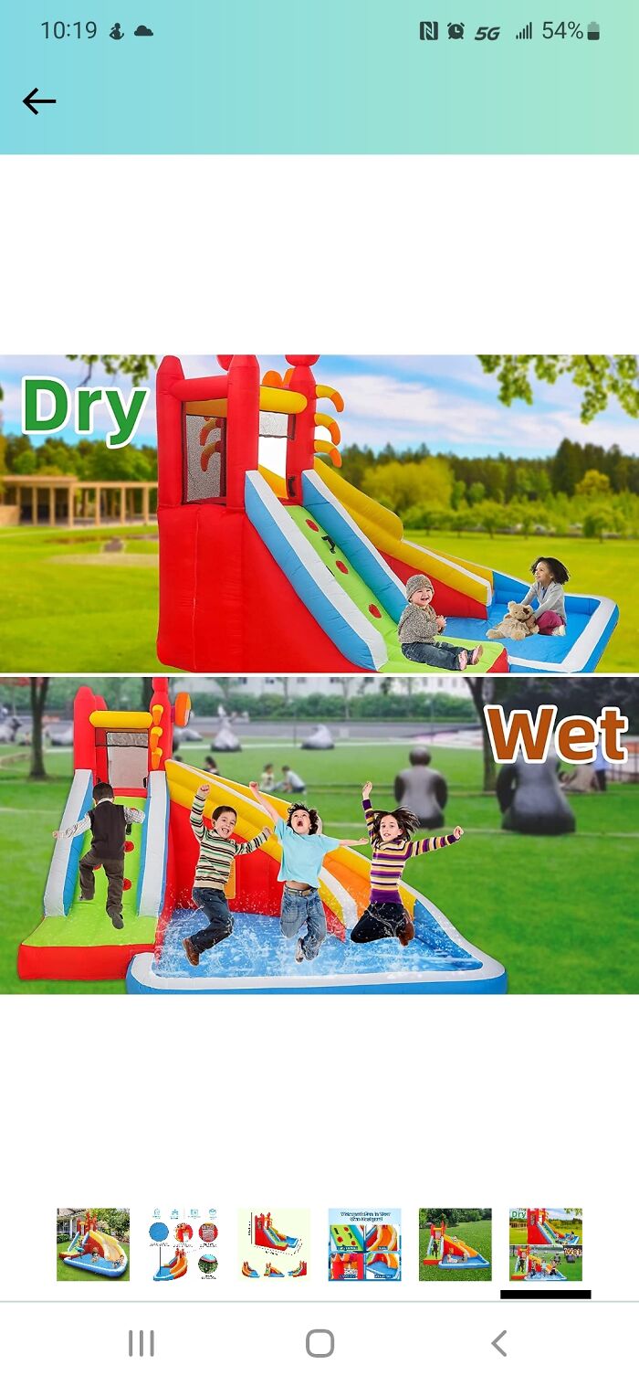
Image credits: Rimm9246
#85 I Found This In The Mall Arcade
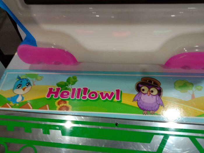
Image credits: Swimming_Poet4458
#86 Putting Letters Like This Almost Never Works, Why Do They Try?
Image credits: Pikataz
#87 I’m Pretty Sure That’s Not An Octagon
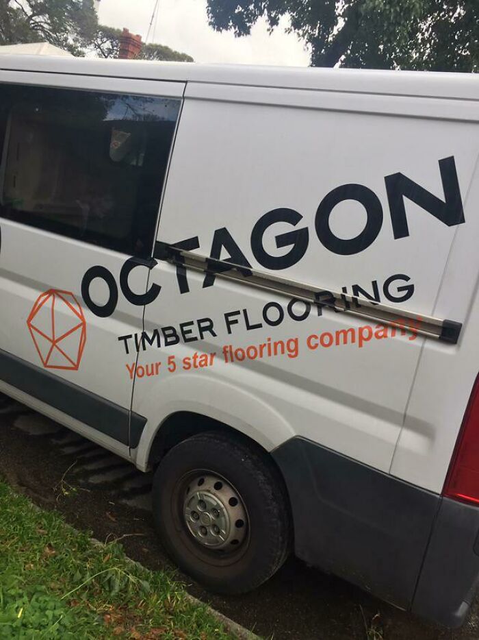
Image credits: vAmmonite
#88 I Have Lots Of Data On A Bad Hardware, Now What
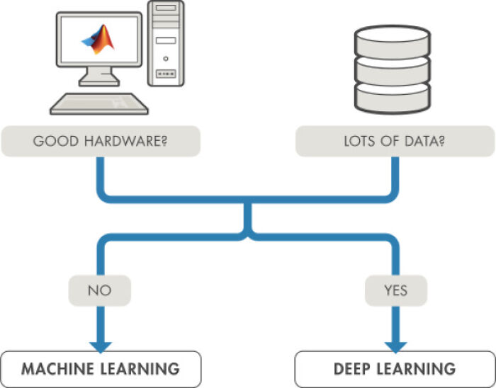
Image credits: simonbacsi
#89 Bought This Geometry Set For My Son, To Help Him In School. Comes With This Map Of The World That Has So Many Countries Spelt Incorrectly. I Don't Know What Country Yogo Is In Europe, But It's There. Panama Is Spelt Banama, But I Suppose They Do Grow Bananas There. Vietnam Is Shown As An Island
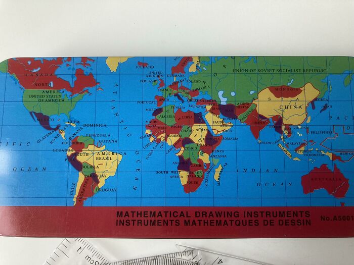
Image credits: QuietPerformance9752
#90 The Tim Hoe Use - Supposed To Read 'The Time House'
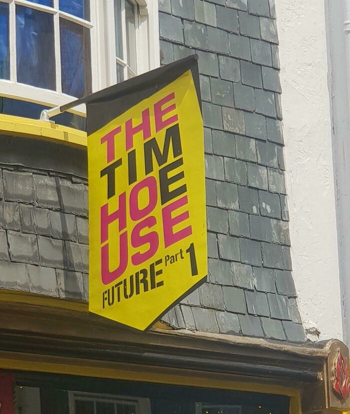
Image credits: Big_ElMo
#91 The Liquid Bleach Place On Our Washer Collects Water And Rusts :/
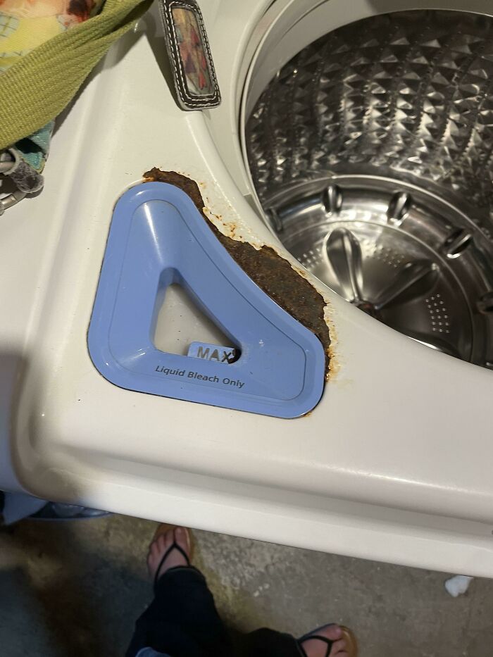
Image credits: crappy_salt
#92 Lomo Hale Vere Tess (No, That’s Not Latin)
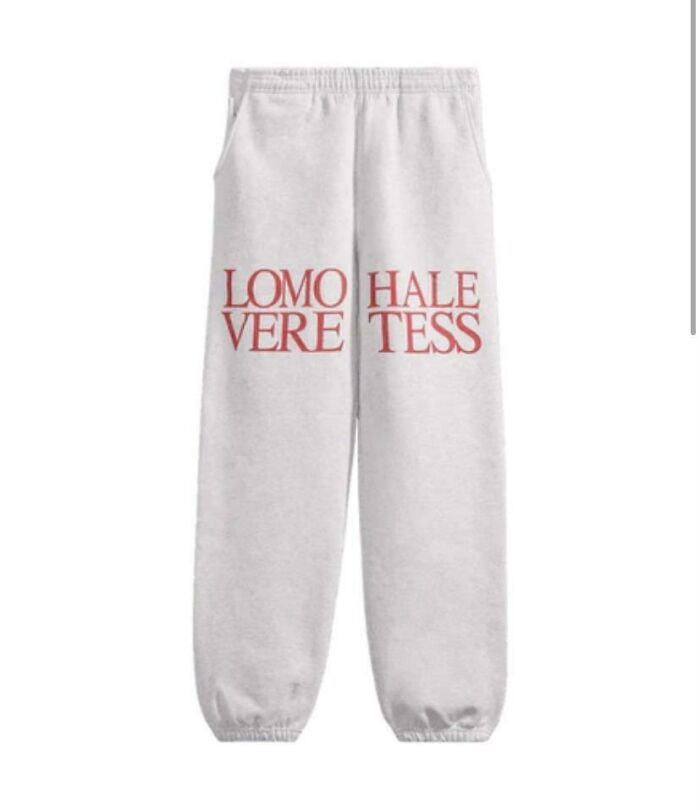
Image credits: CemeteryTide
#93 Fishing For Dinosaurs. Out Of A Police Car
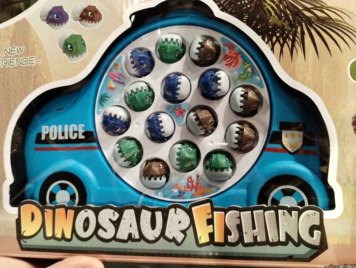
Image credits: Birdboi08
#94 Mixing Upper And Lower Case Doesn’t Work In All Circumstances
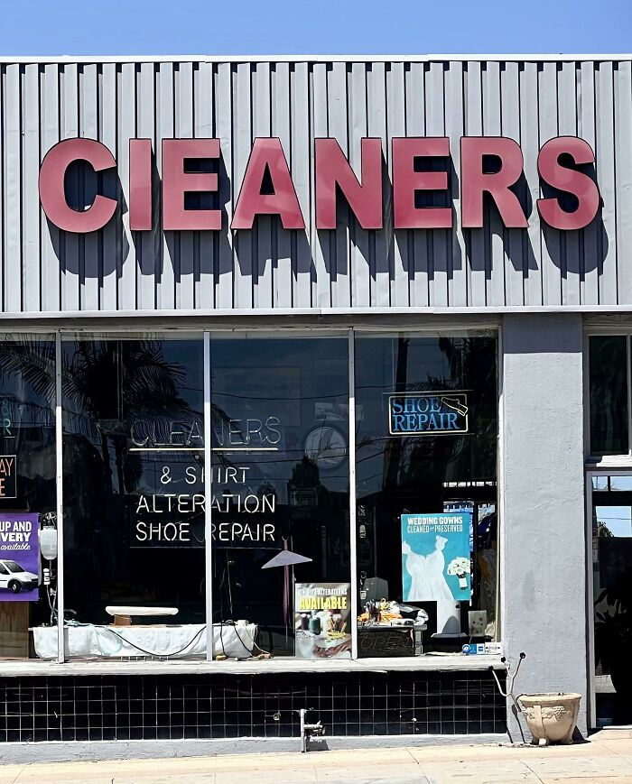
Image credits: tummy_trubble
#95 I Dont Think I've Been To A Mcoads Before
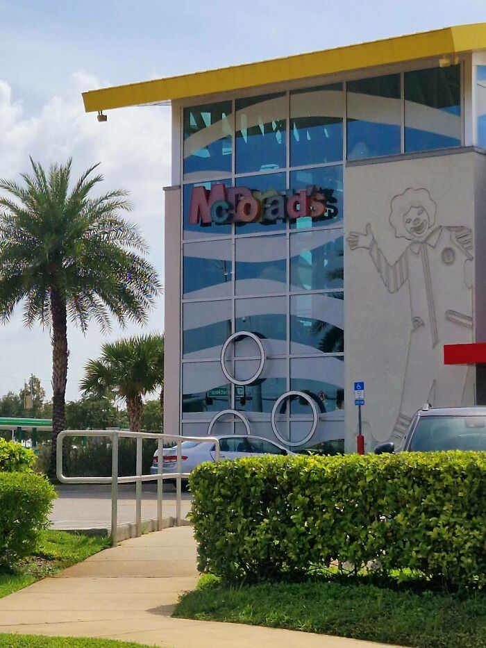
Image credits: literalld
#96 The Post Was Built *after* The House Was
Image credits: TheSoulGamer06
#97 Absolutely Beautiful Architecture Of The Place I Had To Piss In
#98 This Is In Our Hotel Room. Sunshine?
#99 This Alien Looks Like Its Vomiting
#100 Wait... Who's Dying From What Now?
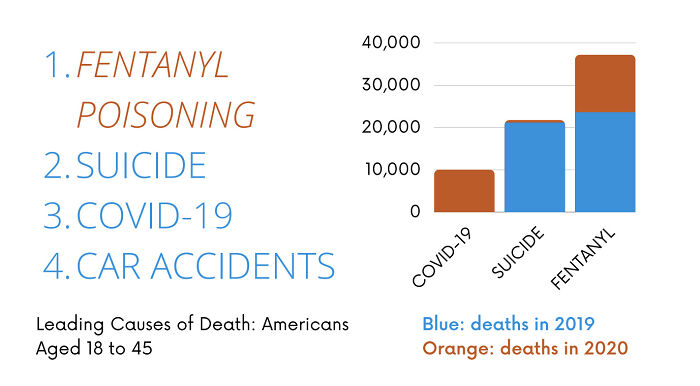
Image credits: MaximusFSU
#101 Can I Park Or Not?
from Bored Panda https://ift.tt/rD4MNWf
