Do you feel like you’ve seen most movie posters somewhere before? You’re not wrong—there are some tried-and-true tropes that designers just keep going back to, and once you notice them, you won’t be able to stop seeing them everywhere you look.
People on Twitter can’t stop talking about these collages put together by French film blogger Christophe Courtois, whose lineups of film posters show color schemes and design trends that have become emblematic of certain genres, storylines and time periods. At the end of 2019, art and design news site Creative Bloq posited that a major contender for “movie poster trend of the decade” was text over a central character’s face, usually in low or desaturated lighting. Here are some more major trends and traditions that the internet has noticed.
People are talking about the most ubiquitous patterns in movie posters
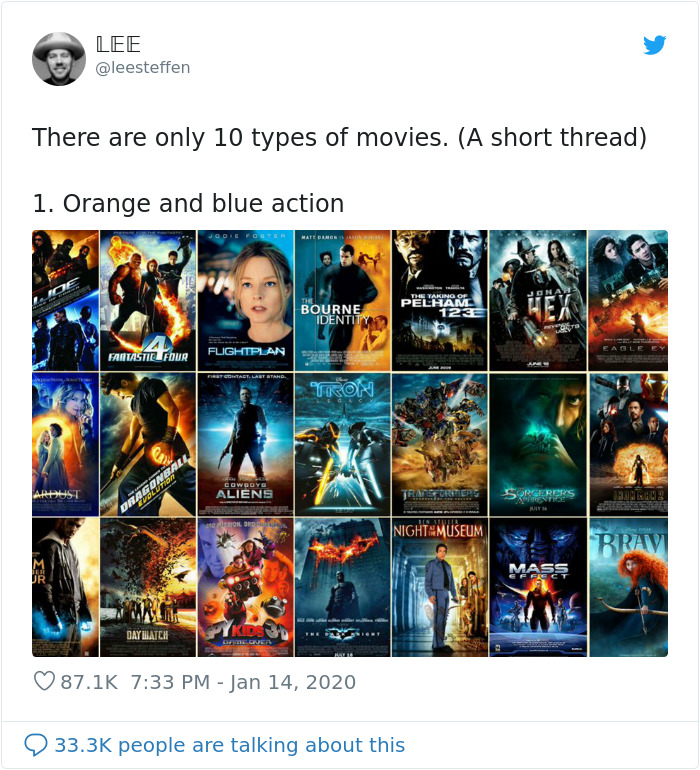
Image credits: leesteffen
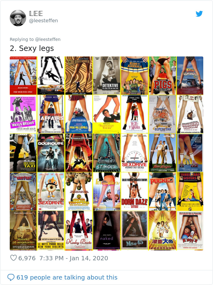
Image credits: leesteffen
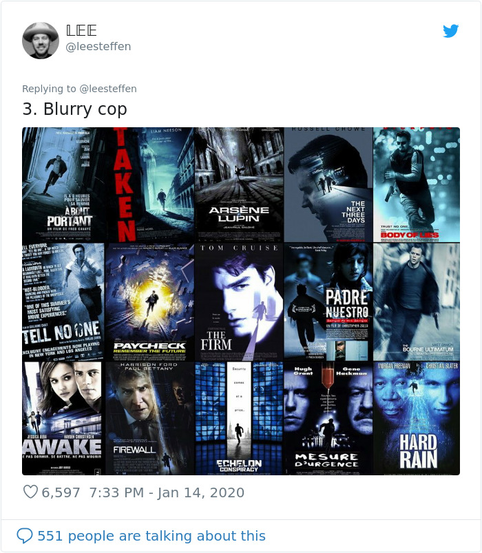
Image credits: leesteffen
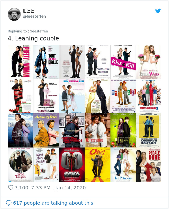
Image credits: leesteffen
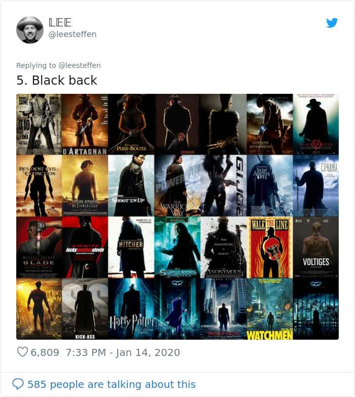
Image credits: leesteffen
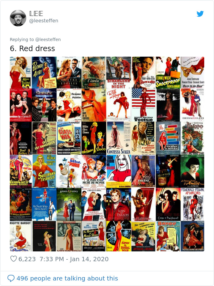
Image credits: leesteffen
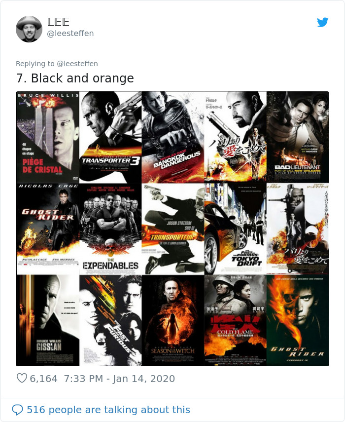
Image credits: leesteffen
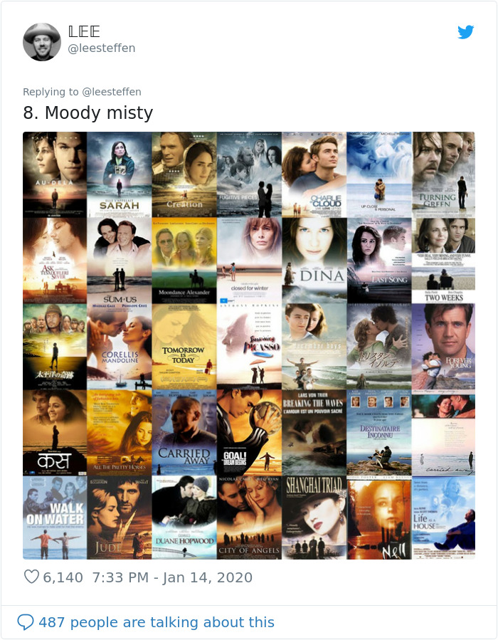
Image credits: leesteffen
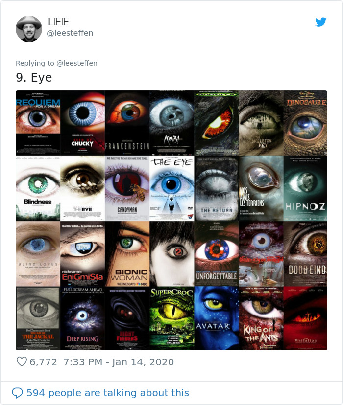
Image credits: leesteffen
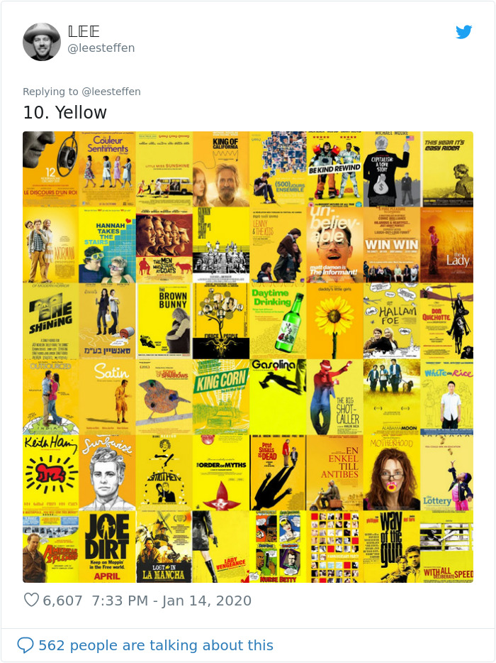
Image credits: leesteffen

Image credits: leesteffen
The collages were made by French film blogger Christophe Courtois
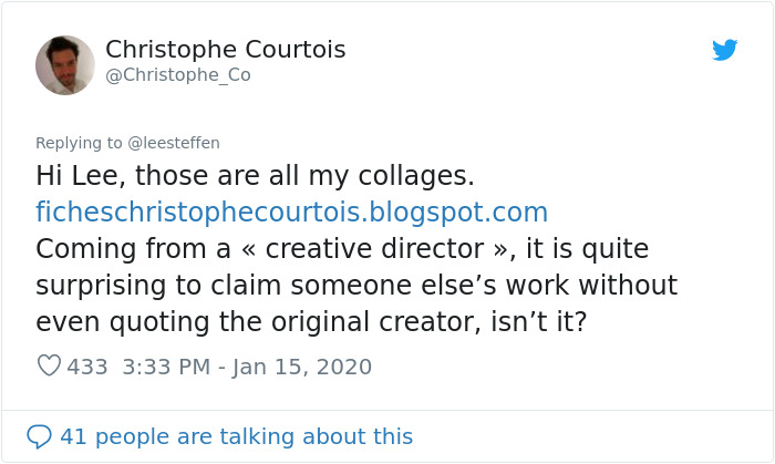
Image credits: Christophe_Co
Tropes aren’t a bad thing. In a way, they show us what to expect. There’s comfort in choosing a product with qualities that we’ve had positive experiences with before, so you can’t blame advertisers for choosing them. Business Insider suggests that maybe the reason why they pop up so often is because of the astronomical price tag of advertising movies in the 21st century—it’s possible that with such a high cost, the marketing team is more inclined to put their money where they’re confident it will pay off, and order a product similar to what has already done well with consumers.
Alternatively, these tropes can be used to subvert our expectations for comic effect, like Puss in Boots, which positions its adorable, furry protagonist’s backlit silhouette facing away from the viewer like an edgy anti-hero. You can also see from Courtois’ collages how some trends, like the spread legs and red dresses, go many decades back and create a campy feel when used to advertise contemporary comedies.
People also commented with their favorite niche movie poster trends, such as the “foreshortened overhead 90s comedy” look of cult stoner movies, and suggested their favorite movie posters that they felt took much-needed creative risks and promised something fresh.
Commenters had some observations of their own and named their favorite posters
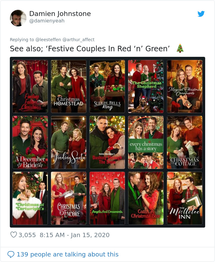
Image credits: damienyeah
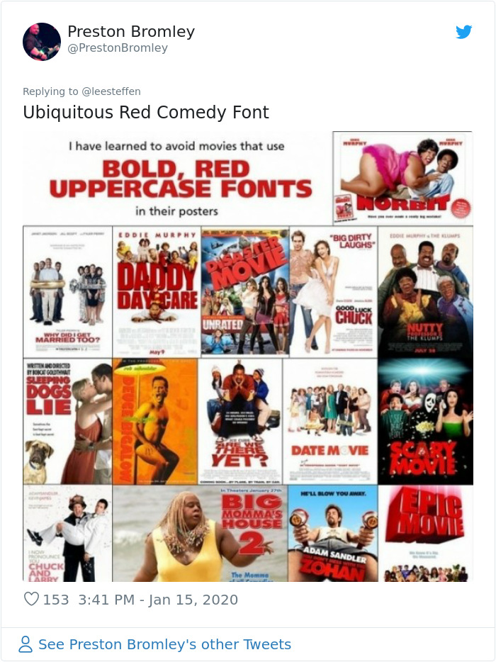
Image credits: PrestonBromley
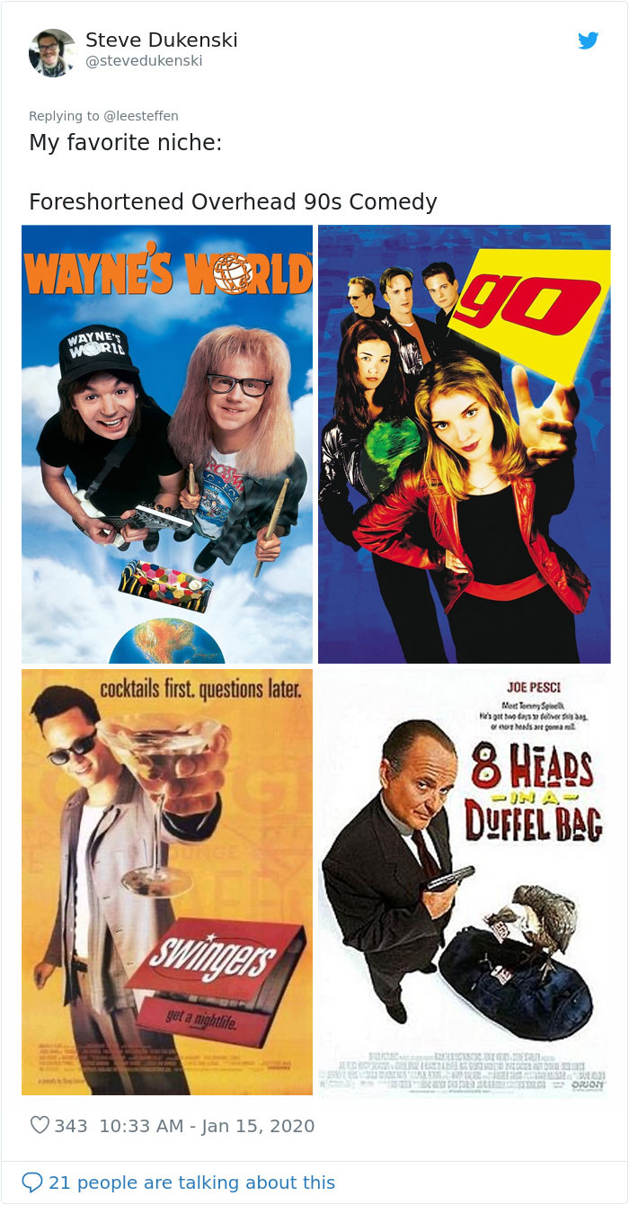
Image credits: stevedukenski
Image credits: TheClementW
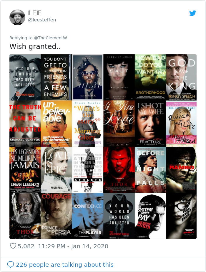
Image credits: leesteffen
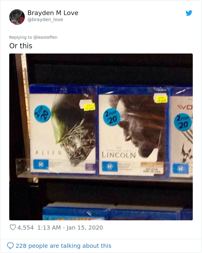
Image credits: brayden_love
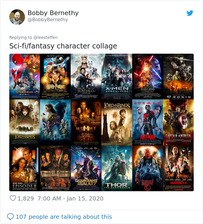
Image credits: BobbyBernethy
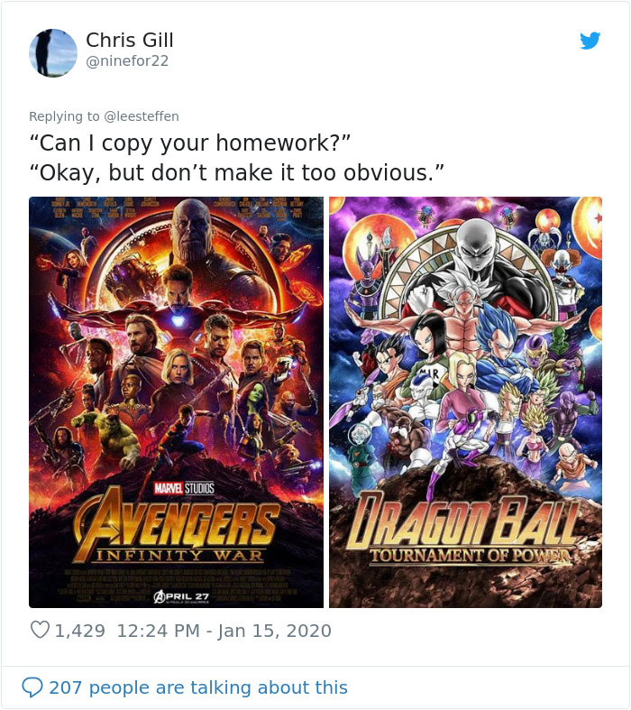
Image credits: ninefor22
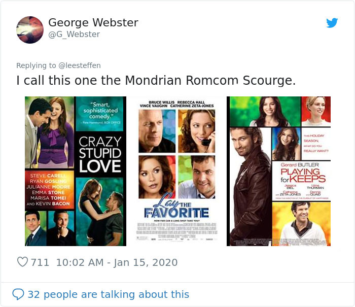
Image credits: G_Webster
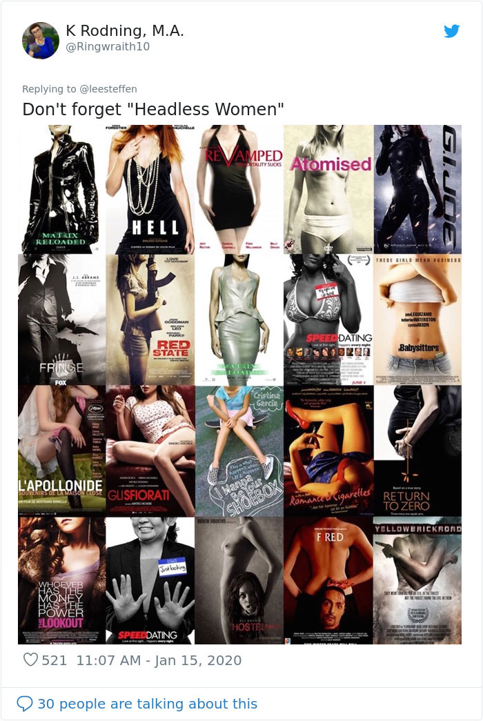
Image credits: Ringwraith10
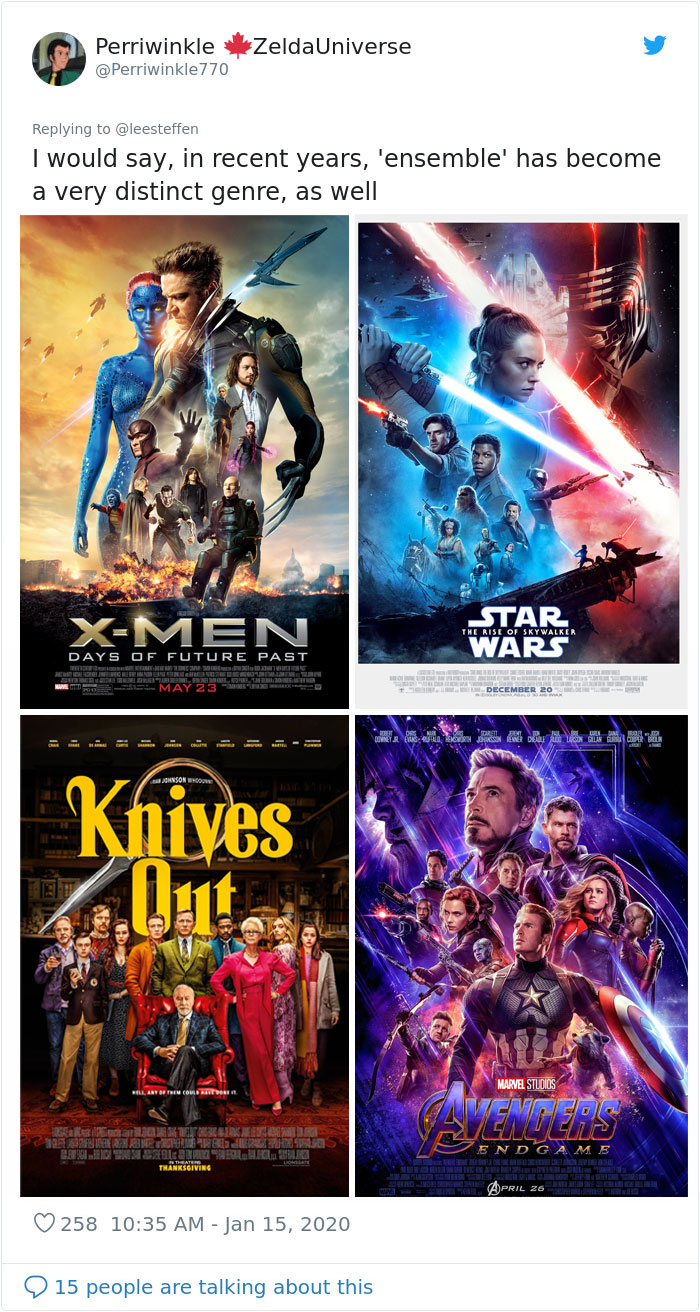
Image credits: Perriwinkle770
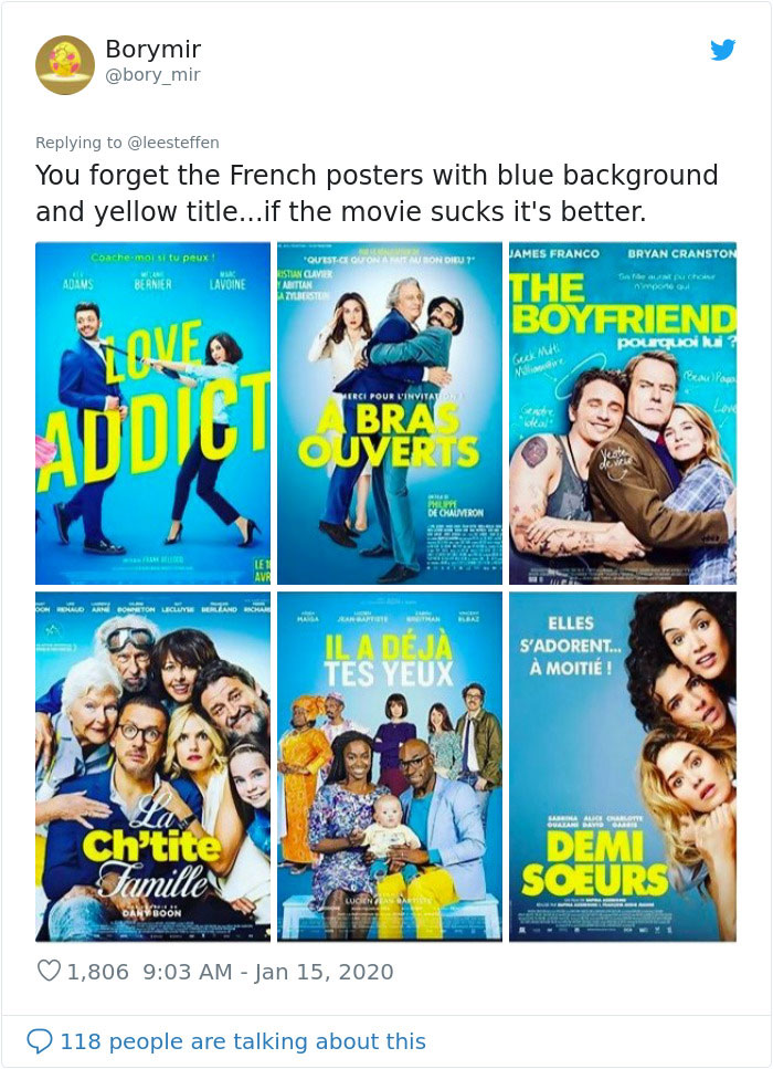
Image credits: bory_mir
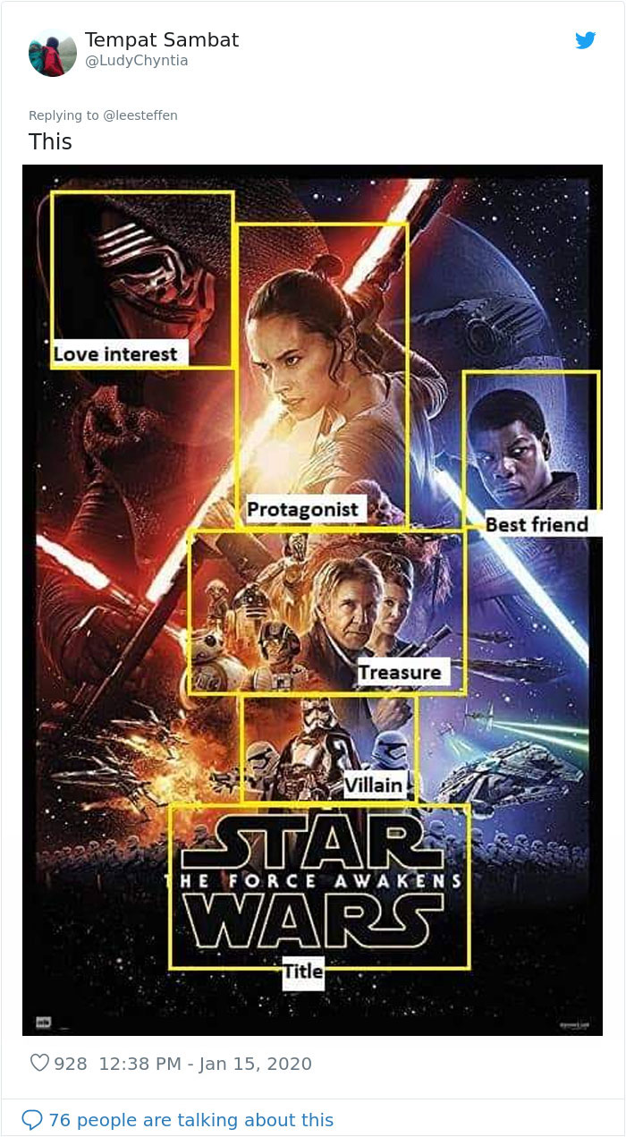
Image credits: LudyChyntia
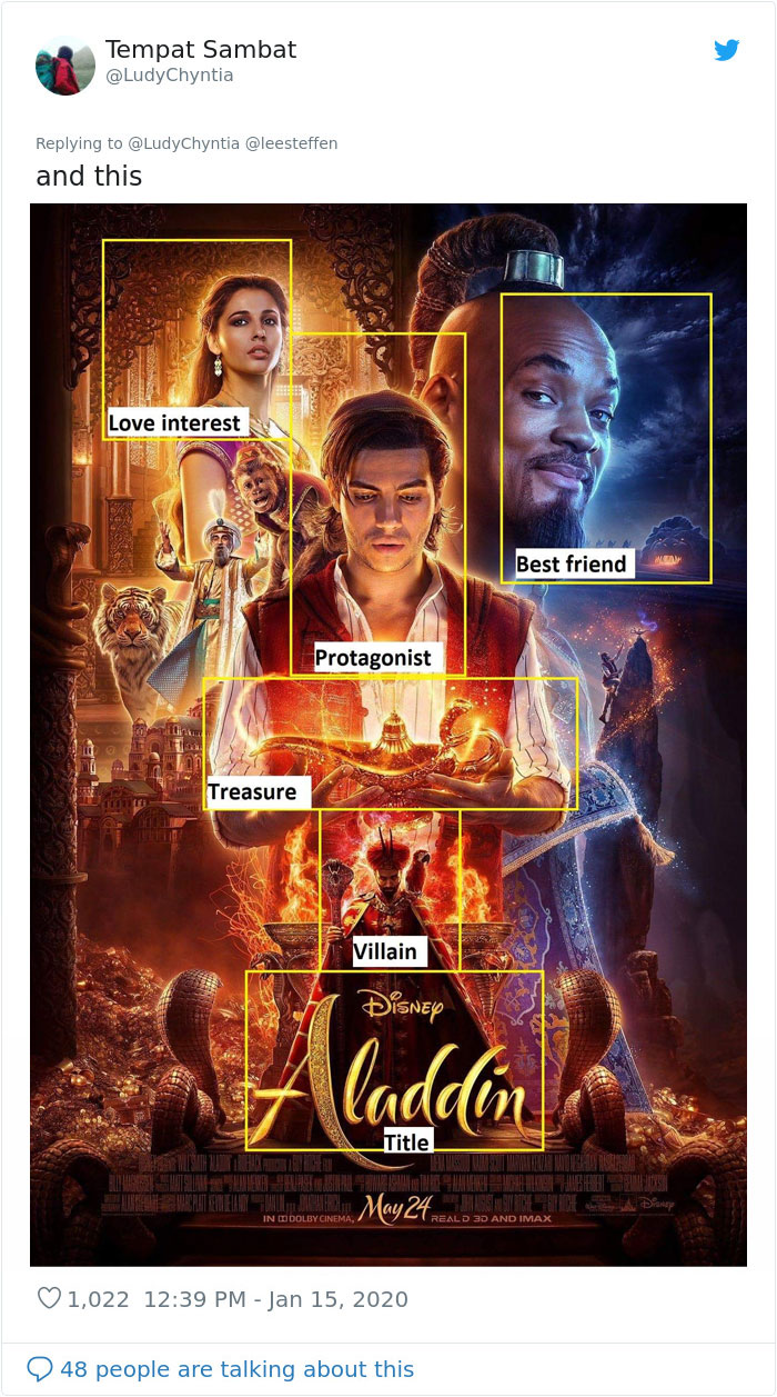
Image credits: LudyChyntia
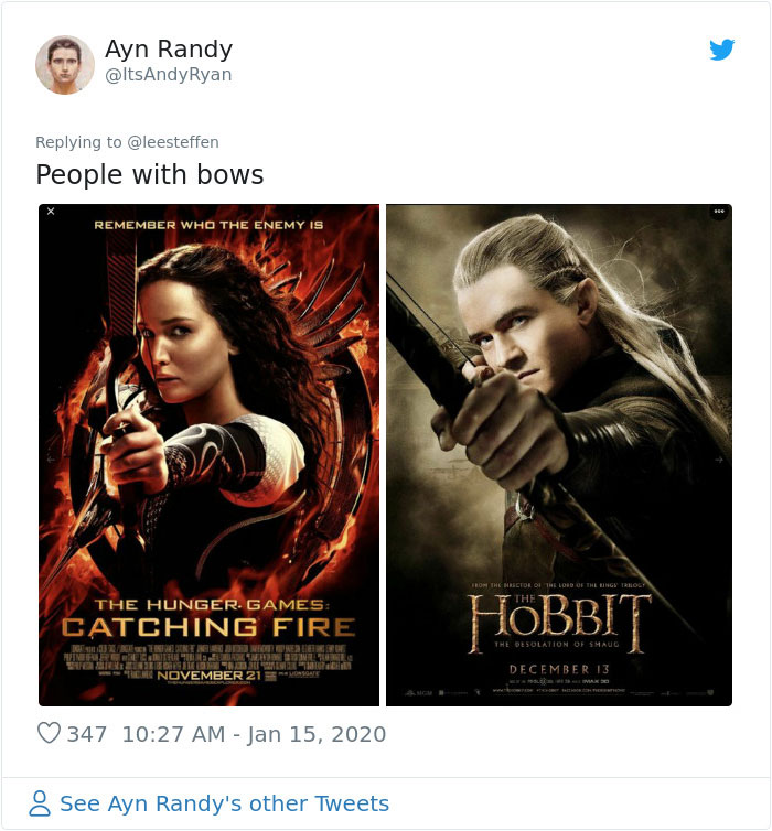
Image credits: ItsAndyRyan
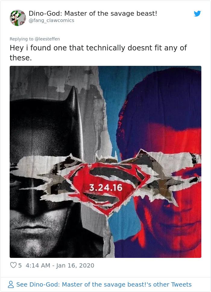
Image credits: fang_clawcomics
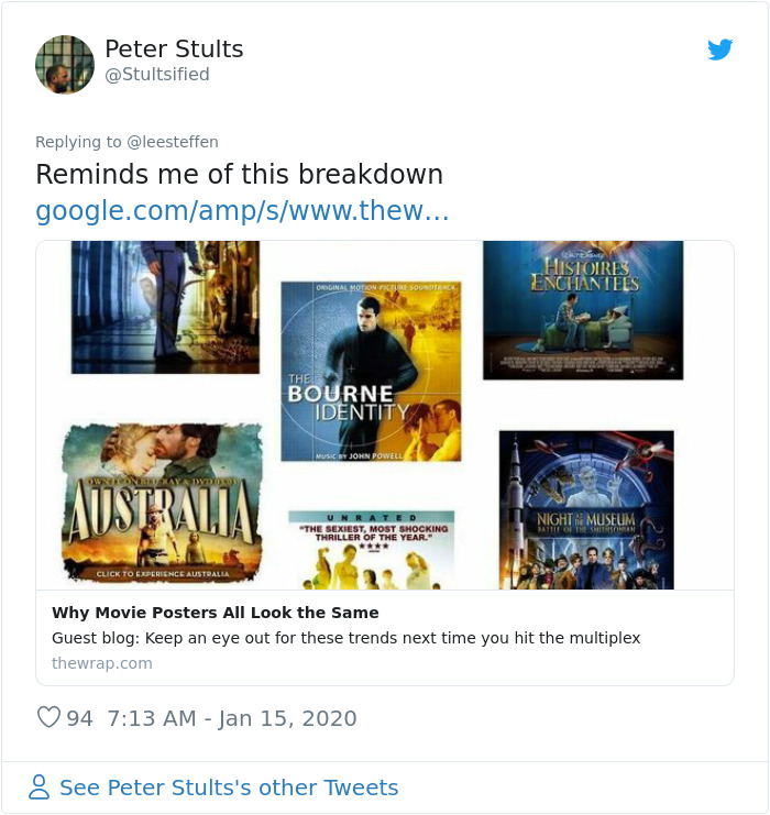
Image credits: Stultsified
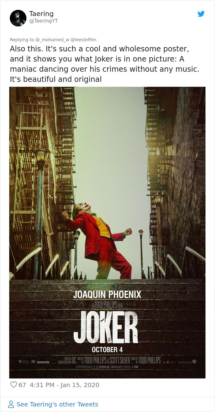
Image credits: TaeringYT
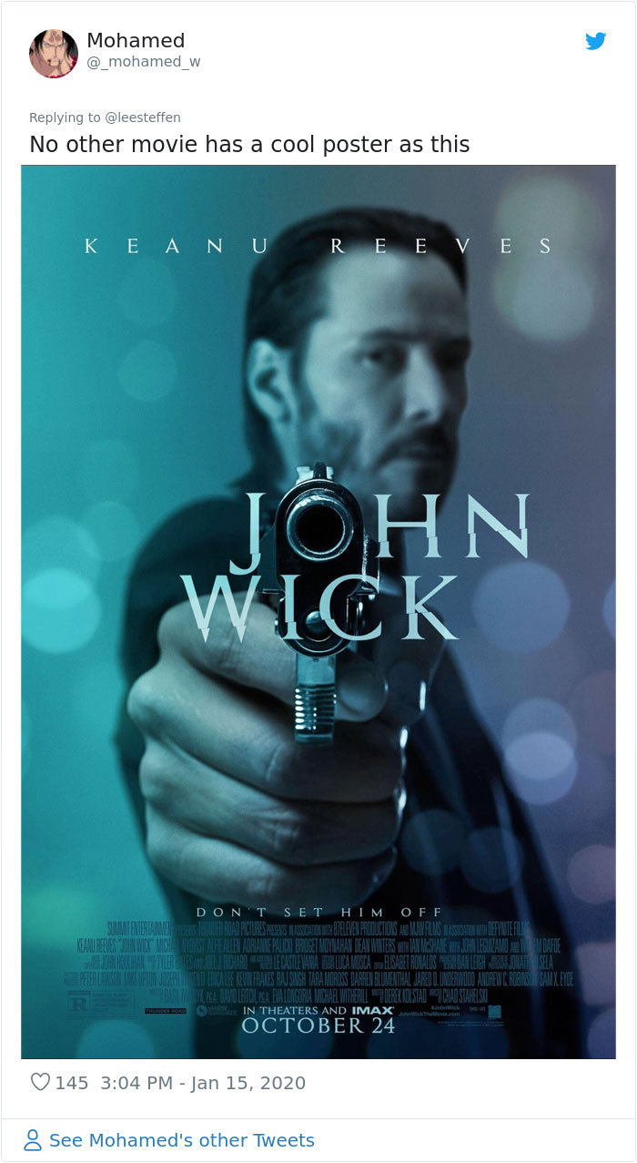
Image credits: _mohamed_w
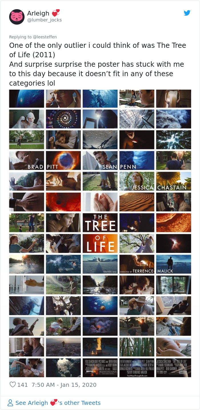
Image credits: lumber_jocks
from Bored Panda https://ift.tt/2QWa1A2

